Mozilla Addons Blog: Firefox Preview/GeckoView Add-ons Support |
Back in June, Mozilla announced Firefox Preview, an early version of the new browser for Android that is built on top of Firefox’s own mobile browser engine, GeckoView. We’ve gotten great feedback about the superior performance of GeckoView so far. Not only is it faster than ever, it also opens up many opportunities for building deeper privacy features that we have already started exploring, and a lot of users were wondering what this step meant for add-ons.
We’re happy to confirm that GeckoView is currently building support for extensions through the WebExtensions API. This feature will be available in Firefox Preview, and we are looking forward to offering a great experience for both mobile users and developers.
Bringing GeckoView and Firefox Preview up to par with the APIs that were supported previously in Firefox for Android won’t happen overnight. For the remainder of 2019 and leading into 2020, we are focusing on building support for a selection of content from our Recommended Extensions program that work well on mobile and cover a variety of utilities and features.
At the moment, Firefox Preview does not yet officially support extensions. While some members of the community have discovered that some extensions inadvertently work in Firefox Preview, we do not recommend attempting to install them until they are officially supported as other issues may arise. We expect to implement support for the initial selection of extensions in the first half of 2020, and will post updates here as we make progress.
If you haven’t yet had a chance, why don’t you give Firefox Preview a try and let us know what you think.
The post Firefox Preview/GeckoView Add-ons Support appeared first on Mozilla Add-ons Blog.
https://blog.mozilla.org/addons/2019/10/23/fx-preview-geckoview-add-ons-support/
|
|
Hacks.Mozilla.Org: The two-value syntax of the CSS Display property |
If you like to read release notes, then you may have spotted in the Firefox 70 notes a line about the implementation of the two-value syntax of the display CSS property. Or maybe you saw a mention in yesterday’s Firefox 70 roundup post. Today I’ll explain what this means, and why understanding this two-value syntax is important despite only having an implementation in Firefox right now.
display propertyThe display property is how we change the formatting context of an element and its children. In CSS some elements are block by default, and others are inline. This is one of the first things you learn about CSS.
The display property enables switching between these states. For example, this means that an h1, usually a block element, can be displayed inline. Or a span, initially an inline element, can be displayed as a block.
More recently we have gained CSS Grid Layout and Flexbox. To access these we also use values of the display property — display: grid and display: flex. Only when the value of display is changed do the children become flex or grid items and begin to respond to the other properties in the grid or flexbox specifications.
display: flexWhat grid and flexbox demonstrate, however, is that an element has both an outer and an inner display type. When we use display: flex we create a block-level element, with flex children. The children are described as participating in a flex formatting context. You can see this if you take a span and apply display: flex to it — the span is now block-level. It behaves as block-level things do in relationship to other boxes in the layout. It’s as if you had applied display: block to the span, however we also get the changed behavior of the children. In the CodePen below you can see that the string of text and the em have become two flex items.
See the Pen
Mozilla Hacks two-value Display: span with display: flex by rachelandrew (@rachelandrew)
on CodePen.
display: gridGrid layout behaves in the same way. If we use display: grid we create a block-level element and a grid formatting context for the children. We also have methods to create an inline-level box with flex or grid children with display: inline-flex and display: inline-grid. The next example shows a div, normally a block-level element, behaving as an inline element with grid item children.
As an inline element, the box does not take up all the space in the inline dimension, and the following string of text displays next to it. The children however are still grid items.
See the Pen
Mozilla Hacks two-value display: inline-grid by rachelandrew (@rachelandrew)
on CodePen.
displayAs the above examples show, the outer display type of an element is always block or inline, and dictates how the box behaves in the normal flow of the document. The inner display type then changes the formatting context of the children.
To better describe this behavior, the CSS Display specification has been refactored to allow for display to accept two values. The first describes whether the outer display type is block or inline, whereas the second value describes the formatting of the children. This table shows how some of these new values map to the single values – now referred to as legacy values – in the spec.
| Single value | New value |
|---|---|
| block | block flow |
| flow-root | block flow-root |
| inline | inline flow |
| inline-block | inline flow-root |
| flex | block flex |
| inline-flex | inline flex |
| grid | block grid |
| inline-grid | inline grid |
There are more values of display, including lists and tables; to see the full set of values visit the CSS Display Specification.
We can see how this would work for Flexbox. If I want to have a block-level element with flex children I use display: block flex, and if I want an inline-level element with flex children I use display: inline flex. The below example will work in Firefox 70.
See the Pen
Mozilla Hacks two-value Display: two value flex values by rachelandrew (@rachelandrew)
on CodePen.
Our trusty display: block and display: inline don’t remain untouched either, display: block becomes display: block flow – that is a block element with children participating in normal flow. A display: inline element becomes display: inline flow.
display: inline-block and display: flow-rootThis all becomes more interesting if we look at a couple of values of display – one new, one which dates back to CSS2. Inline boxes in CSS are designed to sit inside a line box, the anonymous box which wraps each line of text in a sentence. This means that they behave in certain ways: If you add padding to all of the edges of an inline box, such as in the example below where I have given the inline element a background color, the padding applies. And yet, it does not push the line boxes in the block direction away. In addition, inline boxes do not respect width or height (or inline-size and block-size).
Using display: inline-block causes the inline element to contain this padding, and to accept the width and height properties. It remains an inline thing however; it continues to sit in the flow of text.
In this next CodePen I have two span elements, one regular inline and the other inline-block, so that you can see the difference in layout that this value causes.
See the Pen
Mozilla Hacks two-value display: inline-block by rachelandrew (@rachelandrew)
on CodePen.
We can then take a look at the newer value of display, flow-root. If you give an element display: flow-root it becomes a new block formatting context, becoming the root element for a new normal flow. Essentially, this causes floats to be contained. Also, margins on child elements stay inside the container rather than collapsing with the margin of the parent.
In the next CodePen, you can compare the first example without display: flow-root and the second with display: flow-root. The image in the first example pokes out of the bottom of the box, as it has been taken out of normal flow. Floated items are taken out of flow and shorten the line boxes of the content that follows. However, the actual box does not contain the element, unless that box creates a new block formatting context.
The second example does have flow-root and you can see how the box with the grey background now contains the float, leaving a gap underneath the text. If you have ever contained floats by setting overflow to auto, then you were achieving the same thing, as overflow values other than the default visible create a new block formatting context. However, there can be some additional unwanted effects such as clipping of shadows or unexpected scrollbars. Using flow-root gives you the creation of a block formatting context (BFC) without anything else happening.
See the Pen
Mozilla Hacks two-value display: flow-root by rachelandrew (@rachelandrew)
on CodePen.
The reason to highlight display: inline-block and display: flow-root is that these two things are essentially the same. The well-known value of inline-block, creates an inline flow-root which is why the new two-value version of display: inline-block is display: inline flow-root. It does exactly the same job as the flow-root property which, in a two-value world, becomes display: block flow-root.
You can see both of these values used in this last example, using Firefox 70.
See the Pen
Mozilla Hacks two-value display: inline flow-root and block flow-root by rachelandrew (@rachelandrew)
on CodePen.
With support currently available only in Firefox 70, it is too early to start using these two-value properties in production. Currently, other browsers will not support them. Asking for display: block flex will be treated as invalid except in Firefox. Since you can access all of the functionality using the one-value syntax, which will remain as aliases of the new syntax, there is no reason to suddenly jump to these.
However, they are important to be aware of, in terms of what they mean for CSS. They properly explain the interaction of boxes with other boxes, in terms of whether they are block or inline, plus the behavior of the children. For understanding what display is and does, I think they make for a very useful clarification. As a result, I’ve started to teach display using these two values to help explain what is going on when you change formatting contexts.
It is always exciting to see new features being implemented, I hope that other browsers will also implement these two-value versions soon. And then, in the not too distant future we’ll be able to write CSS in the same way as we now explain it, clearly demonstrating the relationship between boxes and the behavior of their children.
The post The two-value syntax of the CSS Display property appeared first on Mozilla Hacks - the Web developer blog.
https://hacks.mozilla.org/2019/10/the-two-value-syntax-of-the-css-display-property/
|
|
Mike Hoye: 80x25 |
Every now and then, my brain clamps on to obscure trivia like this. It takes so much time. “Because the paper beds of banknote presses in 1860 were 14.5 inches by 16.5 inches, a movie industry cartel set a standard for theater projectors based on silent film, and two kilobytes is two kilobytes” is as far back as I have been able to push this, but let’s get started.
In August of 1861, by order of the U.S. Congress and in order to fund the Union’s ongoing war efforts against the treasonous secessionists of the South, the American Banknote Company started printing what were then called “Demand Notes”, but soon widely known as “greenbacks”.
It’s difficult to research anything about the early days of American currency on Wikipedia these days; that space has been thoroughly colonized by the goldbug/sovcit cranks. You wouldn’t notice it from a casual examination, which is of course the plan; that festering rathole is tucked away down in the references, where articles will fold a seemingly innocuous line somewhere into the middle, tagged with an exceptionally dodgy reference. You’ll learn that “the shift from demand notes to treasury notes meant they could no longer be redeemed for gold coins[1]” – which is strictly true! – but if you chase down that footnote you wind up somewhere with a name like “Lincoln’s Treason – Fiat Currency, Maritime Law And The U.S. Treasury’s Conspiracy To Enslave America”, which I promise I am only barely exaggerating about.
It’s not entirely clear if this is a deliberate exercise in coordinated crank-wank or just years of accumulated flotsam from the usual debate-club dead-enders hanging off the starboard side of the Overton window. There’s plenty of idiots out there that aren’t quite useful enough to work the k-cups at the Heritage Institute, and I guess they’re doing something with their time, but the whole thing has a certain sinister elegance to it that the Randroid crowd can’t usually muster. I’ve got my doubts either way, and I honestly don’t care to dive deep enough into that sewer to settle them. Either way, it’s always good to be reminded that the goldbug/randroid/sovcit crank spectrum shares a common ideological klancestor.
Mercifully that is not what I’m here for. I am here because these first Demand Notes, and the Treasury Notes that came afterwards, were – on average, these were imprecise times – 7-3/8” wide by 3-1/4” tall.
I haven’t been able to precisely answer the “why” of that – I believe, but do not know, that that this is because of the size of the specific dimensions of the presses they were printed on. Despite my best efforts I haven’t been able to find the exact model and specifications of that device. I’ve asked the U.S. Congressional Research Service for some help with this, but between them and the Bureau of Engraving and Printing, we haven’t been able to pin it down. From my last correspondence with them:
Unfortunately, we don’t have any materials in the collection identifying the specific presses and their dimension for early currency production. The best we can say is that the presses used to print currency in the 1860s varied in size and model. These presses went by a number of names, including hand presses, flat-bed presses, and spider presses. They also were capable of printing sheets of paper in various sizes. However, the standard size for printing securities and banknotes appears to have been 14.5 inches by 16.5 inches. We hope this bit of information helps.
… which is unfortunate, but it does give us some clarity. A 16.5'' by 14.5'' printing sheet lets you print eight 7-3/8” by 3-1/4'' sheets to size, with a fraction of an inch on either side for trimming.
The answer to that question starts to matter about twenty years later on the heels of the 1880 American Census. Mandated to be performed once a decade, the United States population had grown some 30% since the previous census, and even with enormous effort the final tabulations weren’t finished until 1888, an unacceptable delay.
One of the 1880 Census’ early employees was a man named Herman Hollerith, a recent graduate of the Columbia School of Mines who’d been invited to join the Census efforts early on by one of his professors. The Census was one of the most important social and professional networking exercises of the day, and Hollerith correctly jumped at the opportunity:
The absence of a permanent institution meant the network of individuals with professional census expertise scattered widely after each census. The invitation offered a young graduate the possibility to get acquainted with various members of the network, which was soon to be dispersed across the country.
As an aside, that invitation letter is one of the most important early documents in the history of computing for lots of reasons, including this one:
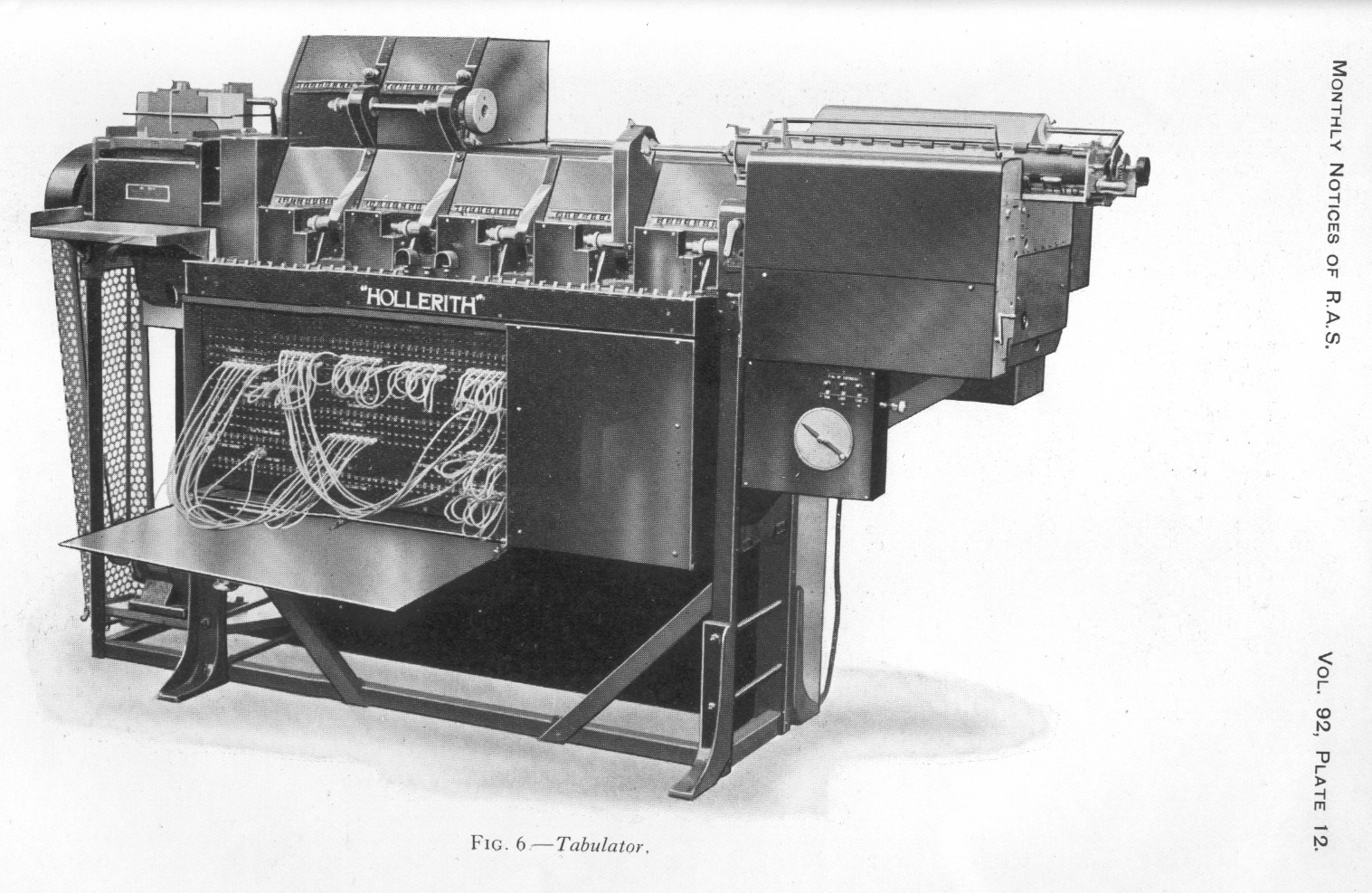
The machine in that picture was the third generation of the “Hollerith Tabulator”, notable for the replaceable plugboard that made it reprogrammable. I need to find some time to dig further into this, but that might be the first multipurpose, if not “general purpose” as we’ve come to understand it, electronic computation device. This is another piece of formative tech that emerged from this era, one that led to directly to the removable panels (and ultimately the general componentization) of later computing hardware.
Well before the model 3, though, was the original 1890 Hollerith Census Tabulator that relied on punchcards much like this one.
Hollerith took the inspiration for those punchcards from the “punch photographs” used by some railways at the time to make sure that tickets belonged to the passengers holding them. You can see a description of one patent for them here dating to 1888, but Hollerith relates the story from a few years earlier:
One thing that helped me along in this matter was that some time before I was traveling in the west and I had a ticket with what I think was called a punch photograph. When the ticket was first presented to a conductor he punched out a description of the individual, as light hair, dark eyes, large nose etc. So you see I only made a punch photograph of each person.
Tangentially: this is the birth of computational biometrics. And as you can see from this extract from The Railway News (Vol. XLVIII, No. 1234 , published Aug. 27, 1887) people have been concerned about harassment because of unfair assessment by the authorities from day one:

After experimenting with a variety of card sizes Hollerith decided that to save on production costs he’d use the same boxes the U.S. Treasury was using for the currency of the day: the Demand Note. Punch cards stayed about that shape, punched with devices that looked a lot like this for about 20 years until Thomas Watson Sr. (IBM’s first CEO, from whom the Watson computer gets its name) asked Clair D. Lake and J. Royden Peirce to develop a new, higher data-density card format.
Tragically, this is the part where I need to admit an unfounded assertion. I’ve got data, the pictures line up and numbers work, but I don’t have a citation. I wish I did.
Take a look at “Type Design For Typewriters: Olivetti, written by Maria Ramos Silvia. (You can see a historical talk from her on the history of typefaces here that’s also pretty great.)
Specifically, take a look on page 46 at Mikron Piccolo, Mikron Condensed. The fonts don’t precisely line up – see the different “4”, for example, when comparing it to the typesetting of IBM’s cards – but the size and spacing do. In short: a line of 80 characters, each separated by a space, is the largest round number of digits that the tightest typesetting of the day would allow to be fit on a single 7-3/8” wide card: a 20-point condensed font.
I can’t find a direct citation for this; that’s the only disconnect here. But the spacing all fits, the numbers all work, and I’d bet real money on this: that when Watson gave Lake the task of coming up with a higher information-density punch card, Lake looked around at what they already had on the shelf – a typewriter with the highest-available character density of the day, on cards they could manage with existing and widely-available tooling – and put it all together in 1928. The fact that a square hole – a radical departure from the standard circular punch – was a patentable innovation at the time was just icing on the cake.
The result of that work is something you’ll certainly recognize, the standard IBM punchcard, though of course there’s lot more to it than that. Witness the full glory of the Card Stock Acceptance Procedure, the protocol for measuring folding endurance, air resistance, smoothness and evaluating the ash content, moisture content and pH of the paper, among many other things.
At one point sales of punchcards and related tooling constituted a completely bonkers 30% of IBM’s annual profit margin, so you can understand that IBM had a lot invested in getting that consistently, precisely correct.
At around this time John Logie Baird invented the first “mechanical television”; like punchcards, the first television cameras were hand-cranked devices that relied on something called a Nipkow disk, a mechanical tool for separating images into sequential scan lines, a technique that survives in electronic form to this day. By linearizing the image signal Baird could transmit the image’s brightness levels via a simple radio signal and in 1926 he did just that, replaying that mechanically encoded signal through a CRT and becoming the inventor of broadcast television. He would go on to pioneer colour television – originally called Telechrome, a fantastic name I’m sad we didn’t keep – but that’s a different story.
Baird’s original “Televisor” showed its images on a 7:3 aspect ration vertically oriented cathode ray tube, intended to fit the head and shoulders of a standing person, but that wouldn’t last.
For years previously, silent films had been shot on standard 35MM stock, but the addition of a physical audio track to 35MM film stock didn’t leave enough space left over for the visual area. So – after years of every movie studio having its own preferred aspect ratio, which required its own cameras, projectors, film stock and tools (and and and) – in 1929 the movie industry agreed to settle on the Society of Motion Picture And Television Engineers’ proposed standard of 0.8 inches by 0.6 inches, what became known as the Academy Ratio, or as we better know it today, 4:3.
Between 1932 and 1952, when widescreen for cinemas came into vogue as a differentiator from standard television, just about all the movies made in the world were shot in that aspect ratio, and just about every cathode ray tube made came in that shape, or one that could display it reliably. In 1953 studios started switching to a wider “Cinemascope”, to aggressively differentiate themselves from television, but by then television already had a large, thoroughly entrenched install base, and 4:3 remained the standard for in-home displays – and CRT manufacturers – until widescreen digital television came to market in the 1990s.
As computers moved from teleprinters – like, physical, ink-on-paper line printers – to screens, one byproduct of that standardization was that if you wanted to build a terminal, you either used that aspect ratio or you started making your own custom CRTs, a huge barrier to market entry. You can do that if you’re IBM, and you’re deeply reluctant to if you’re anyone else. So when DEC introduced their VT52 terminal, a successor to the VT50 and earlier VT05 that’s what they shipped, and with only 1Kb of display ram (one kilobyte!) it displayed only twelve rows of widely-spaced text. Math is unforgiving, and 80x12=960; even one more row breaks the bank. The VT52 and its successor the VT100, though, doubled that capacity giving users the opulent luxury of two entire kilobytes of display memory, laid out with a font that fit nicely on that 4:3 screen. The VT100 hit the market in August of 1978, and DEC sold more than six million of them over the product’s lifespan.
You even got an extra whole line to spare! Thanks to the magic of basic arithmetic 80x25 just sneaks under that opulent 2k limit with 48 bytes to spare.
This is another point where direct connections get blurry, because 1976 to 1984 was an incredibly fertile time in the history of computing history. After a brief period where competing terminal standards effectively locked software to the hardware that it shipped on, the VT100 – being the first terminal to market fully supporting the recently codified ANSI standard control and escape sequences – quickly became the de-facto standard, and soon afterwards the de-jure, codified in ANSI-X3.64/ECMA-48. CP/M, soon to be replaced with PC-DOS and then MS-DOS came from this era, with ANSI.SYS being the way DOS programs talked to the display from DOS 2.0 through to beginning of Windows. Then in 1983 the Apple IIe was introduced, the first Apple computer to natively support an 80x24 text display, doubling the 40x24 default of their earlier hardware. The original XTerm, first released in 1984, was also created explicitly for VT100 compatibility.
Fascinatingly, the early versions of the ECMA-48 standard specify that this standard isn’t solely meant for displays, specifying that “examples of devices conforming to this concept are: an alpha-numeric display device, a printer or a microfilm output device.”
A microfilm output device! This exercise dates to a time when microfilm output was a design constraint! I did not anticipate that cold-war spy-novel flavor while I was dredging this out, but it’s there and it’s magnificent.
It also dates to a time that the market was shifting quickly from mainframes and minicomputers to microcomputers – or, as we call them today, “computers” – as reasonably affordable desktop machines that humans might possibly afford and that companies might own a large number of, meaning this is also where the spectre of backcompat starts haunting the industry – This moment in a talk from the Microsoft developers working on the Windows Subsystem for Linux gives you a sense of the scale of that burden even today. In fact, it wasn’t until the fifth edition of ECMA-48 was published in 1991, more than a decade after the VT100 hit the market, that the formal specification for terminal behavior even admitted the possibility (Appendix F) that a terminal could be resized at all, meaning that the existing defaults were effectively graven in stone during what was otherwise one of the most fertile and formative periods in the history of computing.
As a personal aside, my two great frustrations with doing any kind of historical CS research remain the incalculable damage that academic paywalls have done to the historical record, and the relentless insistence this industry has on justifying rather than interrogating the status quo. This is how you end up on Stack Overflow spouting unresearched nonsense about how “4 pixel wide fonts are untidy-looking”. I’ve said this before, and I’ll say it again: whatever we think about ourselves as programmers and these towering logic-engines we’ve erected, we’re a lot more superstitious than we realize, and by telling and retelling these unsourced, inaccurate just-so stories without ever doing the work of finding the real truth, we’re betraying ourselves, our history and our future. But it’s pretty goddamned difficult to convince people that they should actually look things up instead of making up nonsense when actually looking things up, even for a seemingly simple question like this one, can cost somebody on the outside edge of an academic paywall hundreds or thousands of dollars.
So, as is now the usual in these things:
But if you ever wondered why just about every terminal in the world is eighty characters wide and twenty-five characters tall, there you go.
|
|
Mozilla GFX: Dramatically reduced power usage in Firefox 70 on macOS with Core Animation |
In Firefox 70 we changed how pixels get to the screen on macOS. This allows us to do less work per frame when only small parts of the screen change. As a result, Firefox 70 drastically reduces the power usage during browsing.
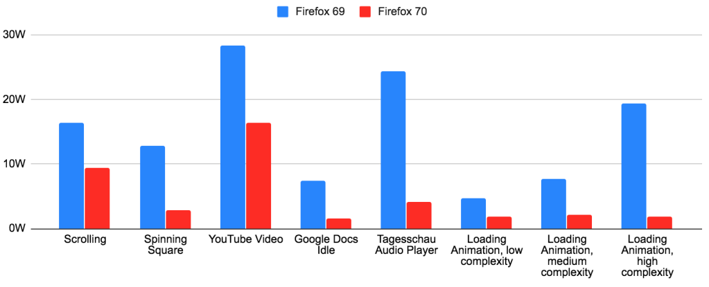
In short, Firefox 70 improves power usage by 3x or more for many use cases. The larger the Firefox window and the smaller the animation, the bigger the difference. Users have reported much longer battery life, cooler machines and less fan spinning.
I’m seeing a huge improvement over here too (2015 13'' MacBook Pro with scaled resolutions on internal display as well as external 4K display). Prior to this update I literally couldn’t use Firefox because it would spin my fans way up and slow down my whole computer. Thank you, I’m very happy to finally see Core Animation being implemented.
Charlie Siegel
After so many years, I have been able to use Firefox on my Mac – I used to test every Firefox release, and nothing had worked in the past.
Vivek Kapoor
I usually try nightly builds every few weeks but end up going back to Edge Chromium or Chrome for speed and lack of heat. This makes my 2015 mbp without a dedicated dGPU become a power sipper compared to earlier builds.
atiensivu
Read on for the technical details behind these changes.
Let’s take a brief look at how the Firefox compositing pipeline works. There are three major steps to getting pixels on the screen:

The improvements in Firefox 70 were the result of reducing the work in steps 2 and 3: In both steps, we were doing work for the entire window, even if only a small part of the window was updating.
Why was our compositor always redrawing the entire window? The main reason was the lack of convenient APIs on macOS for partial compositing.
The Firefox compositor on macOS makes use of hardware acceleration via OpenGL. Apple’s OpenGL documentation recommends the following method of getting OpenGL content to the screen: You create an NSOpenGLContext, you attach it to an NSView (using -[NSOpenGLContext setView:]), and then you render to the context’s default framebuffer, filling the entire framebuffer with fresh content. At the end of each frame, you call -[NSOpenGLContext flushBuffer]. This updates the screen with your rendered content.
The crucial limitation here is that flushBuffer gives you no way to indicate which parts of the OpenGL context have changed. This is a limitation which does not exist on Windows: On Windows, the corresponding API has full support for partial redraws.
Every Firefox window contains one OpenGL context, which covers the entire window. Firefox 69 was using the API described above. So we were always redrawing the whole window on every change, and the window manager was always copying our entire window to the screen on every change. This turned out to be a problem despite the fact that these draws were fully hardware accelerated.
Core Animation is the name of an Apple framework which lets you create a tree of layers (CALayer). These layers usually contain textures with some pixel content. The layer tree defines the positions, sizes, and order of the layers within the window. Starting with macOS 10.14, all windows use Core Animation by default, as a way to share their rendering with the window manager.
So, does Core Animation have an API which lets us indicate which areas inside an OpenGL context have changed? No, unfortunately it does not. However, it provides a number of other useful capabilities, which are almost as good and in some cases even better.
First and foremost, Core Animation lets us share a GPU buffer with the window manager in a way that minimizes copies: We can create an IOSurface and render to it directly using OpenGL by treating it as an offscreen framebuffer, and we can assign that IOSurface to a CALayer. Then, when the window manager composites that CALayer onto the screen surface, it will read directly from our GPU buffer with no additional copies. (IOSurface is the macOS API which provides a handle to a GPU buffer that can be shared between processes. It’s worth noting that the ability to assign an IOSurface to the CALayer contents property is not properly documented. Nevertheless, all major browsers on macOS now make use of this API.)
Secondly, Core Animation lets us display OpenGL rendering in multiple places within the window at the same time and update it in a synchronized fashion. This was not possible with the old API we were using: Without Core Animation, we would have needed to create multiple NSViews, each with their own NSOpenGLContext, and then call flushBuffer on each context on every frame. There would have been no guarantee that the rendering from the different contexts would end up on the screen at the same time. But with Core Animation, we can just group updates from multiple layers into the same CATransaction, and the screen will be updated atomically.
Having multiple layers allows us to update just parts of the window: Whenever a layer is mutated in any way, the window manager will redraw an area that includes the bounds of that layer, rather than the bounds of the entire window. And we can mark individual layers as opaque or transparent. This cuts down the window manager’s work some more for areas of the window that only contain opaque layers. With the old API, if any part of our OpenGL context’s default framebuffer was transparent, we needed to make the entire OpenGL context transparent.
Lastly, Core Animation allows us to move rendered content around in the window cheaply. This is great for efficient scrolling. (Our current compositor does not yet make use of this capability, but future work in WebRender will take advantage of it.)
How do we make use of those capabilities in Firefox now?
The most important change is that Firefox is now in full control of its swap chain. In the past, we were asking for a double-buffered OpenGL context, and our rendering to the default framebuffer was relying on the built-in swap chain. So on every frame, we could guess that the existing framebuffer content was probably two frames old, but we could never know for sure. Because of this, we just ignored the framebuffer content and re-rendered the entire buffer. In the new world, Firefox renders to offscreen buffers of its own creation and it knows exactly which pixels of each buffer need to be updated and which pixels still contain valid content. This allows us to reduce the work in step 2 drastically: Our compositor can now finally do partial redraws. This change on its own is responsible for most of the power savings.
In addition, each Firefox window is now “tiled” into multiple square Core Animation layers whose contents are rendered separately. This cuts down on work in step 3.
And finally, Firefox windows are additionally split into transparent and opaque parts: Transparent CALayers cover the “vibrant” portions of the window, and opaque layers cover the rest of the window. This saves some more work in step 3. It also means that the window manager does not need to redraw the vibrancy blur effect unless something in the vibrant part of the window changes.
The rendering pipeline in Firefox on macOS now looks as follows:
Step 1: Firefox draws pixels into “Gecko layers”.
Step 2: For each square CALayer tile in the window, the Firefox compositor combines the relevant Gecko layers to redraw the changed parts of that CALayer.
Step 3: The operating system’s window manager assembles all updated windows and CALayers on the screen to produce the screen content.
You can use the Quartz Debug app to visualize the improvements in step 3. Using the “Flash screen updates” setting, you can see that the window manager’s repaint area in Firefox 70 (on the right) is a lot smaller when a tab is loading in the background:
And in this screenshot with the “Show opaque regions” feature, you can see that Firefox now marks most of the window as opaque (green):
We are planning to build onto this work to improve other browsing use cases: Scrolling and full screen video can be made even more efficient by using Core Animation in smarter ways. We are targeting WebRender for these further optimizations. This will allow us to ship WebRender on macOS without a power regression.
We implemented these changes with over 100 patches distributed among 28 bugzilla bugs. Matt Woodrow reviewed the vast majority of these patches. I would like to thank everybody involved for their hard work. Thanks to Firefox contributor Mark, who identified the severity of this problem early on, provided sound evidence, and was very helpful with testing. And thanks to all the other testers that made sure this change didn’t introduce any bugs, and to everyone who followed along on Bugzilla.
During the research phase of this project, the Chrome source code and the public Chrome development notes turned out to be an invaluable resource. Chrome developers (mostly Chris Cameron) had already done the hard work of comparing the power usage of various rendering methods on macOS. Their findings accelerated our research and allowed us to implement the most efficient approach right from the start.
|
|
Hacks.Mozilla.Org: Firefox 70 — a bountiful release for all |
|
|
About:Community: Firefox 70 new contributors |
With the release of Firefox 70, we are pleased to welcome the 45 developers who contributed their first code change to Firefox in this release, 32 of whom were brand new volunteers! Please join us in thanking each of these diligent and enthusiastic individuals, and take a look at their contributions:
https://blog.mozilla.org/community/2019/10/22/firefox-70-new-contributors/
|
|
The Mozilla Blog: Latest Firefox Brings Privacy Protections Front and Center Letting You Track the Trackers |
|
|
The Mozilla Blog: The Illusion of choice and the need for default privacy protection |
Since July 2019, Firefox’s Enhanced Tracking Protection has blocked over 450 Billion third-party tracking requests from exploiting user data for profit. This shocking number reveals the sheer scale of online tracking and it highlights why the current advertising industry push on transparency, choice and “consent” as a solution to online privacy simply won’t work. The solutions put forth by other tech companies and the ad industry provide the illusion of choice. Let’s step through the reasons why that is and why we ultimately felt it necessary to enable Enhanced Tracking Protection by default.
A few months ago, we began to enable Enhanced Tracking Protection, which protects Firefox users from cookie-based tracking by default. We did this for a few reasons:
1. People do not expect their data to be sent to, and collected by, third-party companies as they browse the web. For example, 72% of people do not expect that Facebook uses “Like” buttons to collect data about a person’s online activity on websites outside of Facebook (when the buttons are not actually clicked). Many in the ad industry will point to conversion rates for behaviorally targeted ads as evidence for consumers being okay with the privacy tradeoff, but people don’t know they are actually making such a tradeoff. And even if they were aware, we shouldn’t expect them to have the information necessary to evaluate the tradeoff. When people are asked explicitly about it, they are generally opposed. 68% of people believe that using online tracking to tailor advertisements is unethical.
2. The scale of the problem is immense. We currently see about 175 tracking domains being blocked per Firefox client per day. This has very quickly resulted in over 450B trackers being blocked in total since July. You can see the numbers accelerate in the beginning of September after we enabled Enhanced Tracking Protection for all users.
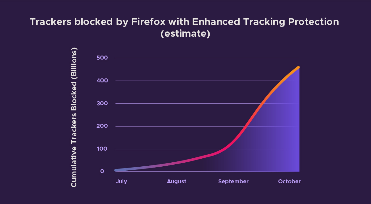
Estimate of Tracking Requests Blocked by Firefox with Enhanced Tracking Protection
It should be clear from these numbers that users would be quickly overwhelmed if they were required to make individual choices about data sharing to this many companies.
3. The industry uses dark patterns to push people to “consent” via cookie/consent banners.
We’ve all had to click through consent banners every time we visit a new site. Let’s walk through the dark patterns in one large tech company’s consent management flow as an example, keeping in mind that this experience is not unique — you can find plenty of other examples just like this one. This particular consent management flow shows how these interfaces are often designed counterintuitively so that users likely don’t think they are agreeing to be tracked. We’ve redacted the company name in the example to focus on the content of the experience.
To start off, we’re presented with a fairly standard consent prompt, which is meant to allow the site visitor to make an informed choice about how their data can be collected and used. However note that clicking anywhere on the page provides “consent”. It only gets worse from here…
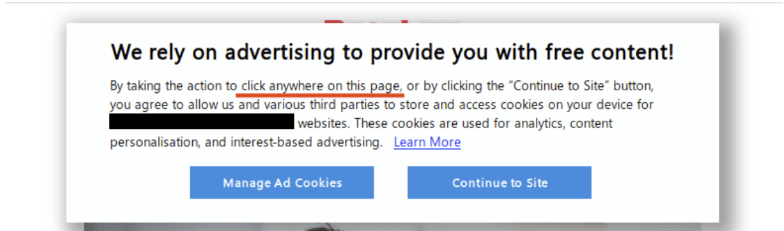
Consent prompt on large tech company website
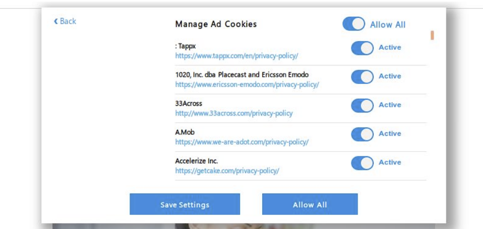
If the user manages to click “Manage Ad Cookies” before clicking elsewhere on the page, they are given the options to “Save Settings” or “Allow All”. According to the highlighted text, clicking either of these buttons at this point provides consent to all partners to collect user data. Users are not given the option to “Disable All”.
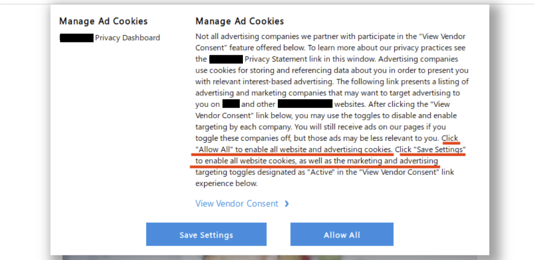
Confusing consent dialog
Instead, if a user wants to manage consent they have to click the link labeled view vendor consent. Wording matters here! If a person is skimming through that dialog they’ll assume that link is informational. This consent flow is constructed to make the cognitive load required to protect oneself as high as possible, while providing ample opportunity to “take the easy way out” and allow all tracking.
Finally, users who make it to the consent management section of the flow are presented with 415 individual sliders. The website provides a global toggle, but let’s assume a user actually wants to make informed choices about each partner. After all, that is the point, right?
Confusing consent mechanism
Eight of the 415 privacy policies linked from the consent management page are inaccessible. They throw certificate errors, fail to resolve, or time out.
Error loading privacy policies for 3rd party partners
The 407 privacy policies that load correctly total over 1.3 million words. That will take the average adult over 86 hours — two solid work weeks — just to read. That doesn’t even consider the time needed to reflect on that information and make an informed choice.
Proposals for “transparency and consent” as a solution to rampant web tracking should be seen for what they really are: proposals to continue business as usual.
Thankfully Firefox blocks almost all of the third-party cookies loaded on the page by default, despite the deceptive methods used to get the visitor to “consent”.
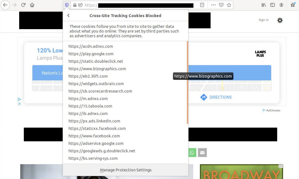
Tracking Cookies Blocked in Firefox by Default
While it is easy to focus on this particular example, this experience is far from unique. The sheer volume of tracker blocking that we see with Firefox’s Enhanced Tracking Protection (around 175 blocks per client per day) confirms that the average individual would never be able to make informed choices about whether or not individual companies can collect their data. This also highlights how tech companies need to do more if they are really serious about privacy, rather than push the burden onto their customers.
Firefox already blocks tracking by default. Today, a new version of Firefox will be released which will make it clear when tracking attempts are happening without your knowledge and it will highlight how Firefox is keeping you safe.
We invite you to try and download the Firefox browser here.
The post The Illusion of choice and the need for default privacy protection appeared first on The Mozilla Blog.
|
|
The Firefox Frontier: Firefox privacy protections reveal who’s trying to track you |
You could say that a web browser is kind of like a car. The engine drives you where you want to go, and a dashboard tells you what’s happening under … Read more
The post Firefox privacy protections reveal who’s trying to track you appeared first on The Firefox Frontier.
https://blog.mozilla.org/firefox/firefox-privacy-protections/
|
|
The Firefox Frontier: New password security features come to Firefox with Lockwise |
Remembering unique, strong passwords for all your accounts and apps is a challenge, but it’s also essential for good digital security. We’re making that easier by helping you generate and … Read more
The post New password security features come to Firefox with Lockwise appeared first on The Firefox Frontier.
https://blog.mozilla.org/firefox/password-security-features/
|
|
The Firefox Frontier: No Judgment Digital Definitions: What is a web tracker? |
Let’s say you’re on an outdoor pizza oven website dreaming about someday owning one. Mmm pizza. Next you switch gears and visit a fitness site; low and behold an ad … Read more
The post No Judgment Digital Definitions: What is a web tracker? appeared first on The Firefox Frontier.
|
|
The Firefox Frontier: No-judgment digital definitions: What are social media trackers? |
Let’s be honest. We’re usually pretty particular about what we post on social media, right? When we’re on vacation, we’ll post photos on Facebook of a beautiful sunset… and crop … Read more
The post No-judgment digital definitions: What are social media trackers? appeared first on The Firefox Frontier.
https://blog.mozilla.org/firefox/what-are-social-media-trackers/
|
|
The Mozilla Blog: Nate Weiner, formerly CEO of Pocket, to take expanded role at Mozilla focused on New Markets |
Nate Weiner, founder and CEO of Pocket, has been promoted to SVP of a new product organization, New Markets, at Mozilla. The New Markets organization will be working to expand and scale Mozilla’s product portfolio alongside the Firefox and Emerging Technologies teams. The Pocket and Emerging Markets teams will live within the New Markets organization.
As part of this change, Pocket Chief Technology Officer and Head of Operations Matt Koidin will step into a new role taking over day-to-day leadership as VP and General Manager of Pocket, continuing to report to Nate. Acquired by Mozilla in 2017, Pocket is a platform used by millions of people worldwide to discover, capture, and spend time with the stories that fascinate and fuel them.
The post Nate Weiner, formerly CEO of Pocket, to take expanded role at Mozilla focused on New Markets appeared first on The Mozilla Blog.
|
|
Hacks.Mozilla.Org: Quickly Alter Typography with Firefox Font Editor |
Fonts and typography are at the heart of design on the web. We now have powerful tools to inspect, understand, and design our typography in the browser. For instance, have you ever landed on a web page and wondered what fonts are being used? Then, have you asked yourself where those fonts come from or why a particular font isn’t loading?
The font editor in Firefox provides answers and insights. You gain the ability to make font changes directly, with a live preview. As for me, I use the editor for understanding variable fonts, how they work, and the options they expose.
Get started with a quick overview by Jen Simmons:
I’ve been using Firefox font tools since they were first released. And yet, I wasn’t aware of all the things the editor can do. Start using the built-in unit-conversion feature, which quickly exposes relative units like em, rem, as well as percents along with computed px values. Interested in more detail? Check out the follow-up video:
Enjoy styling type on the web!
The post Quickly Alter Typography with Firefox Font Editor appeared first on Mozilla Hacks - the Web developer blog.
https://hacks.mozilla.org/2019/10/quickly-alter-typography-with-firefox-font-editor/
|
|
Chris H-C: Four-Year Moziversary |
Wowee what a year that was. And I’m pretty sure the year to come will be even more so.
We gained two new team members, Travis and Beatriz. And with Georg taking a short break, we’ve all had more to do that usual. Glean‘s really been working out well, though I’ve only had the pleasure of working on it a little bit.
Instead I’ve been adding fun new features to Firefox Desktop like Origin Telemetry. I also gave a talk at a conference about Data and Responsibility. Last December’s All Hands returned us to Orlando, and June brought me to Whistler for the first time. We held a Virtual Work Week (or “vorkweek”) a couple of weeks ago when we couldn’t find a time and the budget to meet in person, and spent it planning out how we’ll bring Glean to Firefox Desktop with Project FOG. First with a Prototype (FOGotype) by end of year. And then 2020 will be the year of Glean on the Desktop.
Blogging-wise I’ve slowed down quite a lot. 12 posts so far this calendar year is much lower than previous years’ 25+. The velocity I’d kept up by keeping tabs on the Ontario Provincial Legislature and pontificating about video games I’d played died in the face of mounting work pressures. Instead of spending my off time writing non-mozilla things I spent a lot of it reading instead (as my goodreads account can attest).
But now that I’ve written this one, maybe I’ll write more here.
Resolution for the coming year? More blogging. Continued improvement. Put Glean on Firefox. That is all.
https://chuttenblog.wordpress.com/2019/10/19/four-year-moziversary/
|
|
Cameron Kaiser: TenFourFox FPR16 SPR1 available |
http://tenfourfox.blogspot.com/2019/10/tenfourfox-fpr16-spr1-available.html
|
|
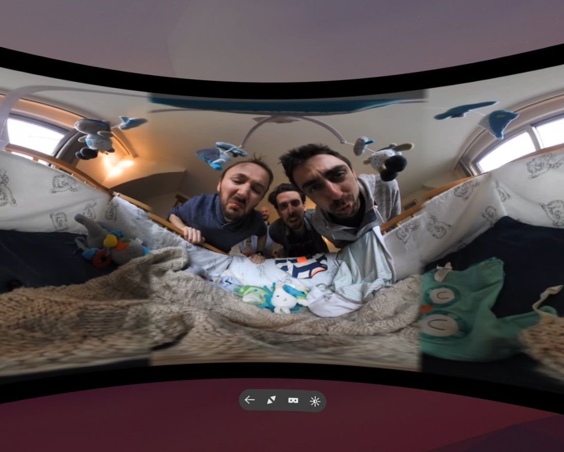
Mozilla VR Blog: Firefox Reality Top Picks - Bringing You New Virtual Reality Experiences Weekly |
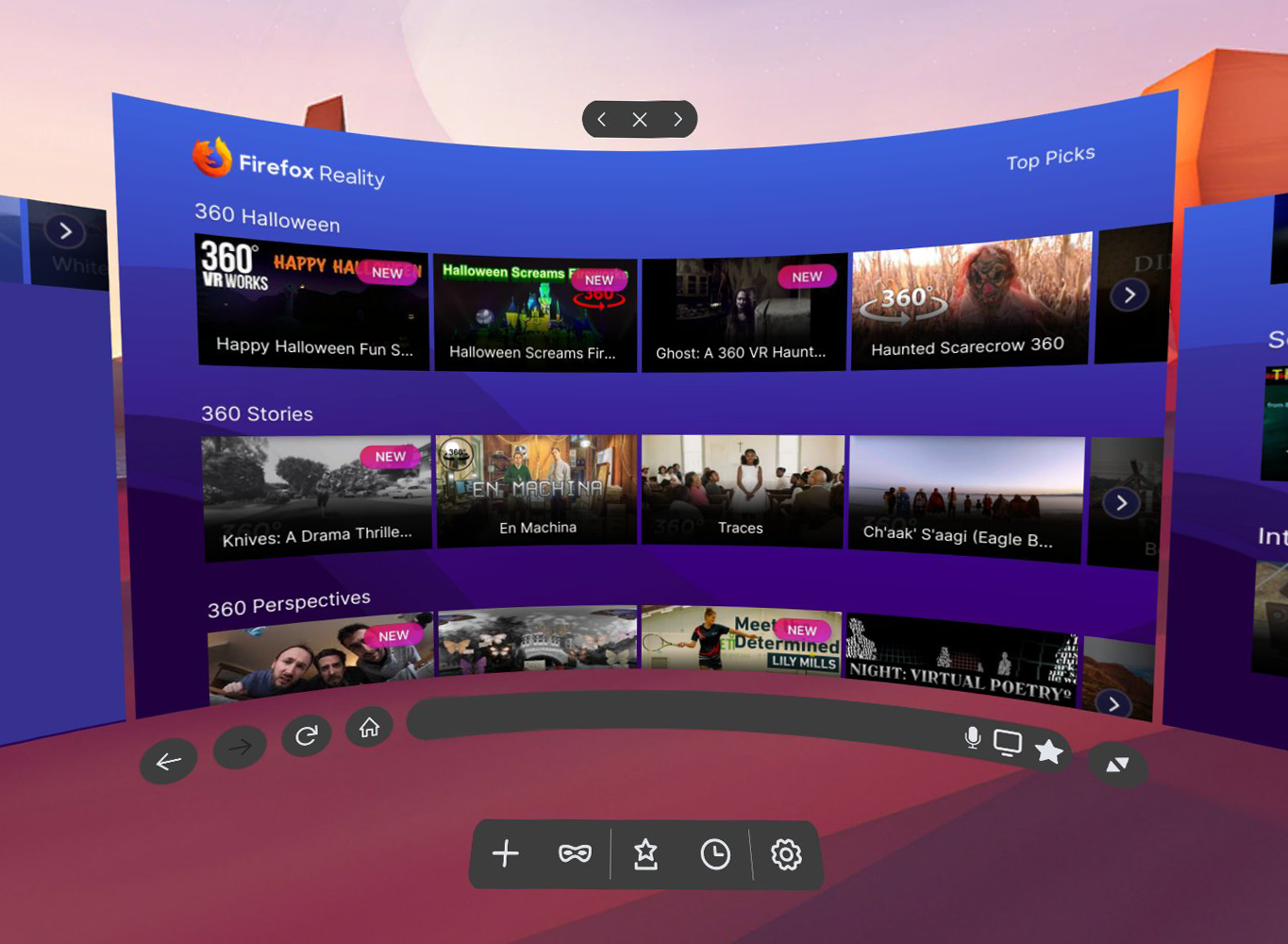
So you bought yourself a fancy VR headset, you’ve played all the zombie-dragon-laser-kitten-battle games (we have too!) and now you’re wondering… what else is there? Where can I find other cool stuff to explore while I have this headset strapped to my face? We felt the same way, so we built Firefox Reality to help you in your quest for the most interesting, groundbreaking and entertaining virtual reality content on the Web.
The real promise of VR is the ability to immerse yourself into countless other places and perspectives - both real and imaginary - and to experience things you’ve never done before. Our Top Picks page is a great place to start exploring, with fresh recommendations coming weekly so you always have new content to check out. Of course, if you want to explore on your own, you can use Firefox Reality for that too.
Firefox Reality Top Picks is the start of what we hope will evolve into a thriving and sustainable ecosystem connecting creators, VR content, and audience.
Unlike browsers that recommend content by mining your data and using AI, the content featured in the Firefox Reality Top Picks menu is curated by real humans. We build relationships with creator communities and scour the Web seeking the best experiences we can find from around the world. We keep our finger firmly on the pulse of what’s hottest, freshest and most engaging in the rapidly changing world of emerging tech content.
We seek out creators where they tend to congregate: at conferences, festivals, meetups and hackathons, on LinkedIn and in creator / developer Facebook and Reddit groups, and through artist networks. We also dig around the vast reaches of the Web and spend countless hours in headset watching and evaluating virtual reality videos and interacting with experiences, discovering first-hand what we need to have warnings for (like motion sickness, phobias, strong language or potentially triggering subject matter), so that you know before you dive in what you’re going into.
There are certain things we’re looking for, such as the quality of the video, editing, use of animation or special effects, the presence or absence of major technical flaws, and whether “best practices” for shooting and editing 360 video or building an interactive experience have been followed. If best practices aren’t followed, we like to see they’re being broken for a reason. We’re excited by new ways of storytelling, interesting ways to explore familiar places and concepts, simple-but-effective interactive games and experiences that can be played by anyone right over the Web.
Along with technical quality, we’re interested in the creative aspects of the work - the concept, the story, the theme, the characters and so on. But when evaluating immersive content, there’s another layer - how the creator has made use of immersivity and/or interactivity. Does this feel like a story or experience that was specifically created for 360 space? Are the creators using traditional aspects of storytelling/journalism/art/music to do something new or different? Did the concept have to be told in 360 space or require interactivity to be effective?
For example: The French piece Bebe Moche, featured currently in 360 Perspectives, tackles traditional physical slapstick comedy in 360 space. The French comedy troupe behind Bebe Moche have a whole series of short comedic “sketch” videos like this, and we’ll be showcasing them in Top Picks menu. Featuring the same cast and exploring physical comedy, they are a simple, effective experiments in physical storytelling that transcends verbal language. Perhaps equally important, it’s the kind of 360 video project that anyone could tackle with a decent 360 camera and video editing software.
Both content creators and audience are a key part of our journey as we work to make Firefox Reality a must-have tool for discovering, experiencing and sharing virtual reality content. If you are a creator interested in making a 360 video or interactive experience, or you want to know if the work you’re already making is WebXR-compatible, make sure to check out our Immersive Media Content Guide; it’s a great starting point for understanding more about how to make and share your own work.
If you have or know of an amazing 360 video or interactive experience you’d like our team to consider featuring on Firefox Reality Top Picks, please submit it to us here.
Firefox Reality 5 is available now. You can see our most recent release notes here. Go and get it!
Download for Oculus Go
Download for Oculus Quest
Download for Viveport
|
|
Hacks.Mozilla.Org: Faster Layouts with CSS Grid (and Subgrid!) |
CSS Grid has been available in most major browsers since early 2017, and it makes web layout more powerful than ever before. But complex-looking new syntax (line-names! grid-areas! minmax! fit-content! fr units!) and missing IE11 support can make it scary to many developers.
Don’t let that stop you: CSS Grid has made my layout process faster and simpler, with more flexibility. We can get started with a few basics, and the fallbacks don’t have to be overwhelming:
With Subgrid, we can also start to lay out nested elements on a shared grid, great for card layouts:
as well as common form patterns:
The post Faster Layouts with CSS Grid (and Subgrid!) appeared first on Mozilla Hacks - the Web developer blog.
https://hacks.mozilla.org/2019/10/faster-layouts-with-css-grid-and-subgrid/
|
|
Mozilla Localization (L10N): L10n Report: October Edition |
Please note some of the information provided in this report may be subject to change as we are sometimes sharing information about projects that are still in early stages and are not final yet.
Are you a locale leader and want us to include new members in our upcoming reports? Contact us!
As explained in detail in the previous l10n report, cycles are starting to shorten towards the goal of 4 weeks. While Firefox 70 is going to be released in a few days, on October 22, the deadline to ship any update in Firefox 71 will be on November 19.
Talking about Firefox 71, congratulations to Catalan (Valencian) (ca-valencia), Tagalog (tl), and Triqui (trs) for reaching an important milestone: with this version, they will move to Beta, and then will be officially released on December 3. Thanks to them, Firefox 71 will be shipping with 96 localizations.
We have also added two new locales to Nightly in 71: Bodo (brx) and Tibetan (bo). If you speak one of these languages and want to help, head to Pontoon!
Talking about new content to localize, there are two main focus areas in 71:
A lot of content is made available for localization. The last code push to production is on October 21 which will include localized content for the October launch.
A few pages were made available for localization in the last two weeks.
The new donate website is available in Pontoon, with the most critical strings (UI and payment flow). As a reminder, the old project is still available on Pontoon as read-only, in case you need to find a previous translation not captured by translation memory. The FAQ and Ways to give pages will be added in the next few days.
The Advocacy team launched a YouTube Regrets site this week, sharing stories sent by YouTube users. Mozilla is showcasing these stories to draw attention to the human impact of optimization algorithms gone wrong and pressure YouTube to be more transparent in their work to fix the problems with their recommendation engine. You can read more about the specifics of the campaign and how it relates to Mozilla work to push for more trustworthy AI in consumer tech here and view the beautiful campaign site here.
Firefox 70 is releasing next week and a lot of new articles have been published or updated:
Firefox Monitor
Password manager = Lockwise
Over the last year, we have been re-building Pontoon’s Translate page from scratch, to use better technologies and enable various sorts of improvements. This new app, nicknamed Translate.Next, has been released to all Pontoon users earlier this week! Find out more in our previous blog post about Translate.Next.
As a direct consequence of this work, we have been able to fix a few long-standing issues with placeables. Unexpected side-effects, better variable handling, catching more terms that should not be translated… the full list of changes can be seen on GitHub.
It’s Outreachy season, and Pontoon is participating! We have thus been seeing a lot of activity from new contributors these last few weeks, leading to more bugs being resolved. Notably, you can now very easily copy the link to a given string thanks to the “Copy Link” functionality:

Mozilla general style guide is updated with revised branding policy.
Testing instructions for the new Mozilla Donate website have been updated.
Want to showcase an event coming up that your community is participating in? Reach out to any l10n-driver and we’ll include that (see links to emails at the bottom of this report)
Know someone in your l10n community who’s been doing a great job and should appear here? Contact on of the l10n-drivers and we’ll make sure they get a shout-out (see list at the bottom)!
Did you enjoy reading this report? Let us know how we can improve by reaching out to any one of the l10n-drivers listed above.
https://blog.mozilla.org/l10n/2019/10/17/l10n-report-october-edition-2/
|
|
Chris H-C: This Week in Glean: Glean on Desktop (Project FOG) |
(“This Week in Glean” is a series of blog posts that the Glean Team at Mozilla is using to try to communicate better about our work. They could be release notes, documentation, hopes, dreams, or whatever: so long as it is inspired by Glean.)
The Glean SDK is doing well on mobile. It’s shipping in Firefox Preview and Firefox for Fire TV on Android, and our iOS port for Lockwise is shaping up wonderfully well. Data is flowing in, letting us know how the products are being used.
It’s time to set our sights on Desktop.
It’s going to be tricky, but to realize one of the core benefits of the Glean SDK (the one about not having to maintain more than one data collection client library across Mozilla’s products) we have to do this. Also, we’re seeing more than a little interest from our coworkers to get going with it already : )
One of the reasons it’s going to be tricky is that Desktop isn’t like Mobile. As an example, the Glean SDK “baseline” ping is sent whenever the product is sent to the background. This is predicated on the idea that the user isn’t using the application when it’s in the background. But on Desktop, there’s no similar application lifecycle paradigm we can use in that way. We could try sending a ping whenever focus leaves the browser (onblur), but that can happen very often and doesn’t have the same connotation of “user isn’t using it”. And what if the focus leaves one browser window to attach to another browser window? We need to have conversations with Data Science and Firefox Peers to figure out what lifecycle events most closely respect our desire to measure engagement.
And that’s just one reason. One reason that needs investigation, exploration, discussion, design, proposal, approval, implementation, validation, and documentation.
And this reason’s one that we actually know something about. Who knows what swarm of unknown quirks and possible failures lies in wait?
That’s why step one in this adventure is a prototype. We’ll integrate the Glean SDK into Firefox Desktop and turn some things on. We’ll try some things out. We’ll make mistakes, and write it all down.
And then we’ll tear it out and, using what we’ve learned, do it over again. For real.
This prototype won’t have an answer for the behaviour of the “baseline” ping… so it won’t have a “baseline” ping. It won’t know the most efficient way to build a JavaScript metrics API (webidl? JSM? JSContext?), so it won’t have one. It won’t know how best to collect data from the many different processes of many different types that Firefox now boasts, so it will live in just one.
This investigative work will be done by the end of the year with the ultimate purpose of answering all the questions we need in order to proceed next year with the full implementation.
That’s right. You heard it here first:
2020 will be the year of Glean on the Desktop.
:chutten
https://chuttenblog.wordpress.com/2019/10/17/this-week-in-glean-glean-on-desktop-project-fog/
|
|


