Niko Matsakis: Next CTCFT Meeting: 2021-09-20 |
Hold the date! The next Cross Team Collaboration Fun Times meeting will be 2021-09-20. We’ll be using the “Asia-friendly” time slot of 21:00 EST.
A detailed agenda will be announced in a few weeks. Current thinking however is to center the agenda on Rust interest groups and domain working groups, those brave explorers who are trying to put Rust to use on all kinds of interesting domains, such as game development, cryptography, machine learning, formal verification, and embedded development. If you run an interest group and I didn’t list your group here, perhaps you want to get in touch! We’ll be talking about how these groups operate and how we can do a better job of connecting interest groups with the Rust org.
Absolutely! The social hour has been an increasingly popular feature of the CTCFT meeting. It will take place after the meeting (22:00 EST).
The CTCFT meetings are announced on this google calendar.
Perceptive readers will note that there was no CTCFT meeting in August. That’s because I and many others were on vacation. =)
http://smallcultfollowing.com/babysteps/blog/2021/08/30/next-ctcft-meeting-2021-09-20/
|
|
Firefox Add-on Reviews: Boost your writing skills with a browser extension |
Whatever kind of writing you do—technical documentation, corporate communications, Harry Potter-vampire crossover fan fiction—it likely happens online. Here are some great browser extensions that will benefit anyone who writes on the web. Get grammar help, productivity tools, and other strong writing aids…
It’s like having your own copy editor with you wherever you write on the web. Language Tool – Grammar and Spell Checker will make you a better writer in 25+ languages.
More than just a spell checker, LanguageTool also…
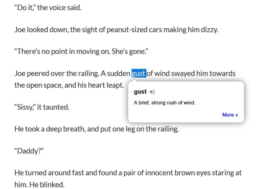
Need a quick word definition? With Dictionary Anywhere just double-click any word you find on the web and get an instant pop-up definition.
You can even save and download words and their definitions for later offline reference.
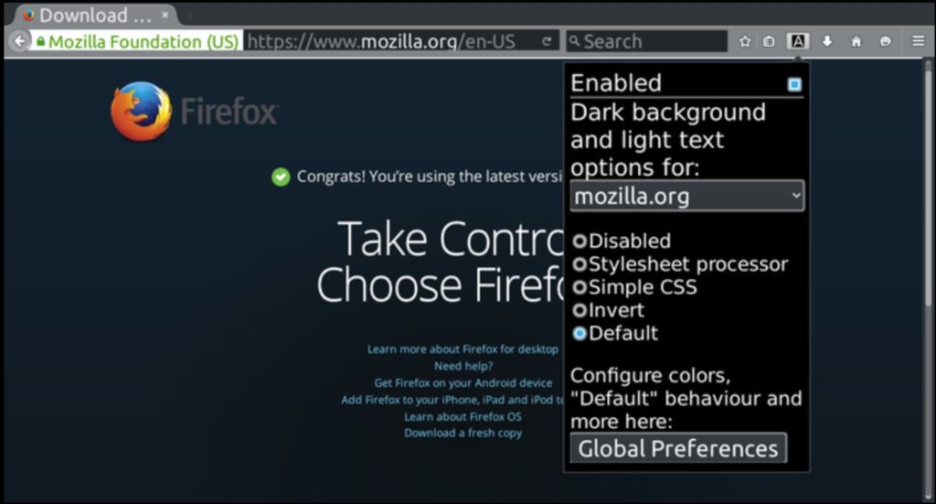
Give your eyes a break, writers. Dark Background and Light Text makes staring at blinking words all day a whole lot easier on your lookers.
Really simple to use out of the box. Once installed, the extension’s default settings automatically flip the colors of every web page you visit. But if you’d like more granular control of color settings, just click the extension’s toolbar button to access a pop-up menu that lets you customize color schemes, set page exceptions for sites you don’t want colors inverted, and more simple controls.
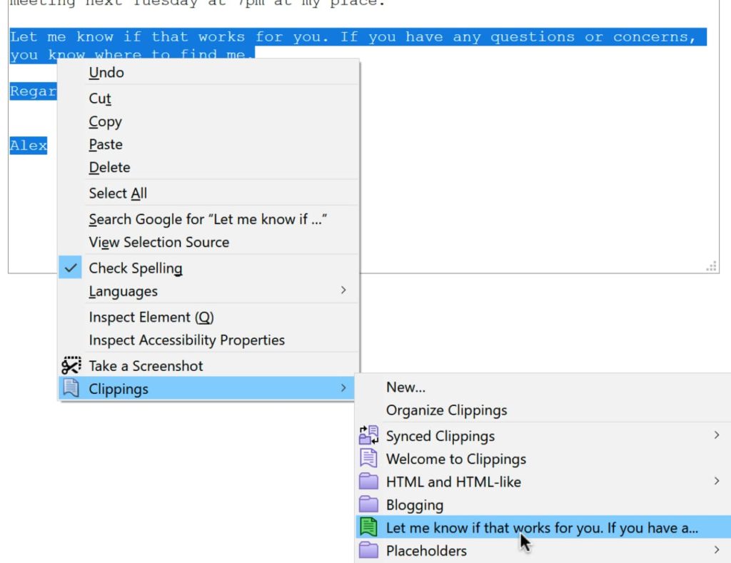
If your online writing requires the repeated use of certain phrases (for example, work email templates or customer support responses), Clippings can be a huge time saver.
Key features…
We hope one of these extensions helps your words pop off the screen. Some writers may also be interested in this collection of great productivity extensions for optimizing written project plans. Feel free to explore thousands of other potentially useful extensions on addons.mozilla.org.
https://addons.mozilla.org/blog/boost-your-writing-skills-with-a-browser-extension/
|
|
The Mozilla Blog: Why are hyperlinks blue? |
The internet has ingrained itself into every aspect of our lives, but there’s one aspect of the digital world that I bet you take for granted. Did you ever notice that many links, specifically hyperlinks, are blue? When a co-worker casually asked me why links are blue, I was stumped. As a user experience designer who has created websites since 2001, I’ve always made my links blue. I have advocated for the specific shade of blue, and for the consistent application of blue, yes, but I’ve never stopped and wondered, why are links blue? It was just a fact of life. Grass is green and hyperlinks are blue. Culturally, we associate links with the color blue so much that in 2016, when Google changed its links to black, it created quite a disruption.
But now, I find myself all consumed by the question, WHY are links blue? WHO decided to make them blue? WHEN was this decision made, and HOW has this decision made such a lasting impact?
I turned to my co-workers to help me research, and we started to find the answer. Mosaic, an early browser released by Marc Andreessen and Eric Bina on January 23, 1993, had blue hyperlinks. To truly understand the origin and evolution of hyperlinks though, I took a journey through technology history and interfaces to explore how links were handled before color monitors, and how interfaces and hyperlinks rapidly evolved once color became an option.
By looking at these pre-color hyperlink solutions, we can see how hyperlinks evolved over time and how these early innovations impact usability on the web today.
Project Xanadu connected two pages of information for the first time in history. Links were visual lines between pages.
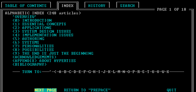
This system introduces color, as it used cyan hyperlinks on a black background. HyperTies was used as an “electric journal.” This may be an ancestor of our blue hyperlink we know and love today, but I do not believe that this is the first instance of the blue hyperlink since this color is cyan, and not dark blue.

Windows 1.0 brought a full color graphic interface. The links and buttons are still black, similar to Apple’s interface at the time. What I do find interesting, however, is that this is the first instance of our dark blue used in a layout. The dark blue is heavily used in the headings and on borders around modals.
Another interesting thing about Windows 1.0 that still appears in modern websites is the underlined hyperlink. This is the first example of an underline being used to indicate a hyperlink that I have been able to find.
To make Windows 1.0 even more interesting, we see the introduction of a hover state. The hallmarks of modern interaction design were alive and well in 1985.
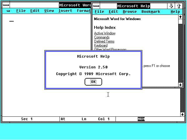
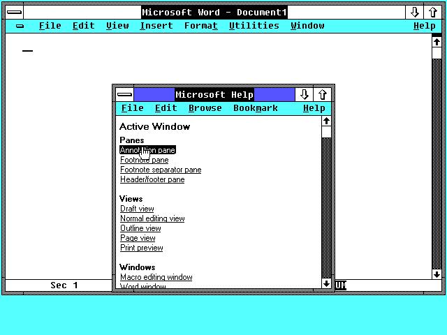
Released by Apple for the Macintosh, this program used hyperlinks between pages and apps. While aesthetically beautiful, this version did not use color in its hyperlinks.
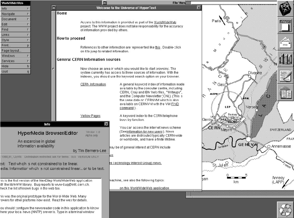
WWW was the first browser created by Tim Berners-Lee while working at CERN. It started out as black and white, with underlines under hyperlinks, which are still used today on modern websites, and are a great solution for colorblindness.
We’ve now been able to narrow down the time frame for the blue hyperlink’s origin. WWW, the first browser, was created in 1987 and was black and white. We know that Mosaic was released on January 23, 1993 and was credited as being the first browser with blue hyperlinks. So far, we have been unable to find blue being used for hyperlinks in any interface before 1987, but as color monitors become more available and interfaces start to support color, things change quickly. The next few years will see massive innovation and experimentation in color and hyperlink management.

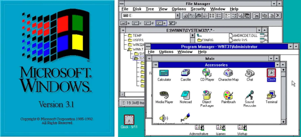
Windows 3 included support for 16 colors, however the text links were still black links on a white background, which turned to white text on a black background when selected.
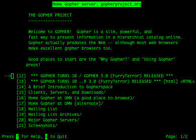
Gopher Protocol was created at the University of Minnesota for searching and retrieving documents. Its original design featured green text on a black background.
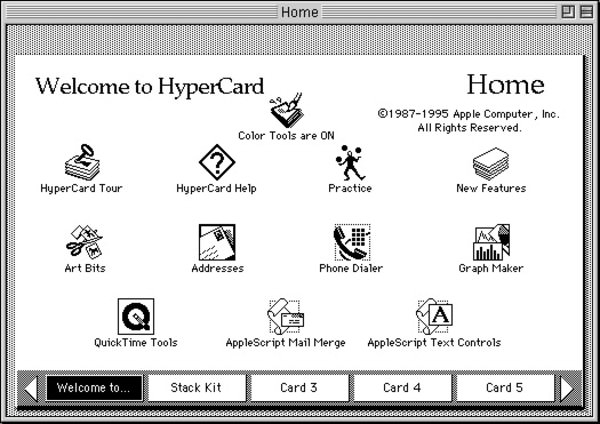
Apple brought color to its HyperCards, but notably, the text links were still black and not blue. However, some UI elements did have blue accents when interacted upon which is incredibly important as it shows the slow shift of blue being used as an interaction color.
Linux used white text on a black background.
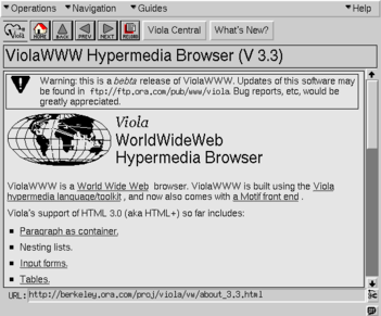
In the ViolaWWW browser, the text links are underlined, and the background color is gray, like we would see is Mosaic’s initial release. However, the text links are black.
Microsoft has been using dark blue for interfaces since 1985, but starting in 1990 they also began using it for interaction. Here Microsoft uses the “hyperlink blue” for active states when a user clicks on different drives, folders and icons. This is incredibly important because it shows the slow evolution of this blue from being a layout color to being an interactive color, preceding the time when blue would have been added to Mosaic by almost exactly a year.
In 1992, Linux Kernel gained support for color in their console.

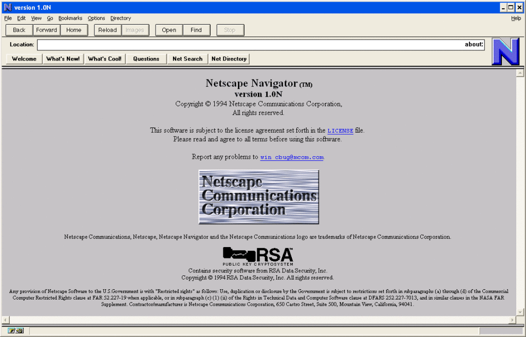
The first beta version of Mosaic was created for the X Window System for the University of Illinois. The original interface was black and white and did not have blue hyperlinks, but had black hyperlinks with a bordered outline. According to the X System user guide, the hyperlinks were underlined or highlighted.
In the changelog for Mosaic for version 0.13, there is one bullet that is of great importance to us:
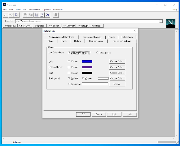
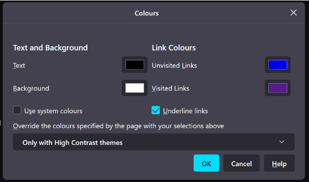
Changed default anchor representations: blue and single solid underline for unvisited, dark purple and single dashed underline for visited.
Release Notes
In the immortal words of Jeff Goldblum’s Ian Malcom character in Jurassic Park, “Well, there it is.”
Mosaic Launched for the X Window System. I was unable to find screenshots of what the interface looked like for this release, but according to the release notes, the visited color was changed to be a “Better visited anchor color for non-SGI’s”.
Cello was created at Cornell Law School so that lawyers could access their legal website from Windows computers. My team mate, Molly, was able to download the 0.1 beta for me, and we were shocked by what we found:
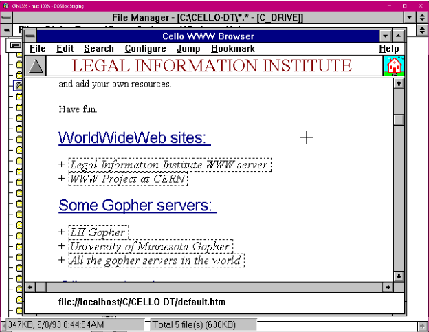
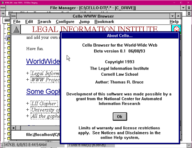
There it was! Our hyperlink style, except it wasn’t a hyperlink, it was the heading. Our “link blue” had never shown up in user interfaces before 1993, and suddenly it appears in two instances within two short months of each other in two separate browsers at two different universities being built at the same time.
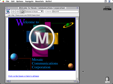
By September, a port of Mosaic was released to the Macintosh 7.1 operating system. I was able to locate a screenshot of this version which included a blue hyperlink which is the first visual evidence of the color blue being used to denote a hyperlink.
Common Desktop Environment is a GUI for the UNIX operating system, the same operating system used to build Mosaic. This interface featured black text with an underline for hyperlinks.
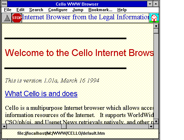
Cello is out of beta, but now features a yellow background, and has kept it’s link-blue underlined headers and still has black hyperlinks with a border.
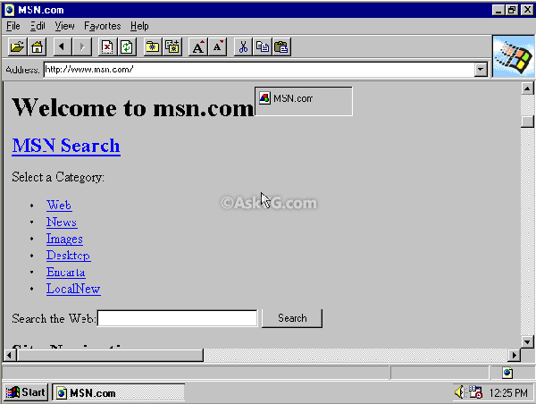
Created by Marc Andreessen and James H. Clark, Netscape used the same visual language of Mosaic: blue hyperlinks and a gray background.
In 1995, Microsoft produced Internet Explorer, and no surprise, it also featured blue hyperlinks and a gray background. Internet Explorer was packaged with Windows 95, which was the first time that a browser came with an operating system. Around this time, the browser wars began, but the look and feel of hyperlinks had been firmly established.
Mozilla Firefox was released, and also featured blue hyperlinks, which are in use to this day. These images are from Netscape 1.22 and Firefox Nightly today.
What happened in 1993 to suddenly make hyperlinks blue? No one knows, but I have some theories.
I often hear that blue was chosen as the hyperlink color for color contrast. Well, even though the W3C wasn’t created until 1994, and so the standards for which we judge web accessibility weren’t yet defined, if we look at the contrast between black as a text color, and blue as a link color, there is a contrast ratio of 2.3:1, which would not pass as enough color contrast between the blue hyperlink and the black text.
Instead, I like to imagine that Cello and Mosaic were both inspired by the same trends happening in user interface design at the time. My theory is that Windows 3.1 had just come out a few months before the beginning of both projects, and this interface was the first to use blue prominently as a selection color, paving the way for blue to be used as a hyperlink color.
Additionally, we know that Mosaic was inspired by ViolaWWW, and kept the same gray background and black text that they used for their interface. Reviewing Mosaic’s release notes, we see in release 0.7 black text with underlines appearing as the preferred way of conveying hyperlinks, and we can infer that was still the case until something happened around mid April right before when blue hyperlinks made their appearance in release 0.13. In fact, conveying links as black text with underlines had been the standard since 1985 with Microsoft 1, which some once claimed Microsoft had stolen from Apple’s Lisa’s look and feel.
I think the real reason why we have blue hyperlinks is simply because color monitors were becoming more popular around this time. Mosaic as a product also became popular, and blue hyperlinks went along for the ride. Mosaic came out during an important time where support for color monitors was shifting; the standard was for hyperlinks to use black text with some sort of underline, hover state or border. Mosaic chose to use blue, and they chose to port their browser for multiple operating systems. This helped Mosaic become the standard browser for internet use, and helped solidify its user interface as the default language for interacting with the web.
When Netscape and Internet Explorer were created, the blue hyperlink was already synonymous with the web and interaction. The blue link was now browser-agnostic and well on its way to becoming a symbol of what it means to use the internet.
It has been almost 30 years since Mosaic put the now ubiquitous blue in its release notes, but it is no longer the early 1990s. While it is quite fun to discover the secrets of how browsers are made, here in the present, we have accepted it as gospel truth that links can and should only be blue because these early pioneers said it should be so.
When the hyperlink was created, limited colors were available. Today we have almost every color option, so what should be the default color and state of links on the internet? When given every opportunity to deviate from tradition, do we do so for the sake of progress, or should we keep the blue because it’s an established visual pattern?
If you are to change the link color, here are my lists of requirements for the perfect color when choosing a link color:
In closing, should all links be blue? Maybe so, or maybe not. There has been a long path of visual elements used to denote hyperlinks, and the color blue is just one of many elements that have come to represent a hyperlink. Links are about connecting information together. Always make sure that a hyperlink stands out from the rest of the surrounding content. Sometimes that means you need an underline, or a background color, or maybe just maybe, you need the color blue.
Major thanks and credit to my colleagues Asa Dotzler, Molly Howell, M.J. Kelly, Michael Hoye, and Damiano DeMonte for help with research and inspiration for this article.
The post Why are hyperlinks blue? appeared first on The Mozilla Blog.
https://blog.mozilla.org/en/internet-culture/deep-dives/why-are-hyperlinks-blue/
|
|
Eitan Isaacson: HTML AQI Gauge |
I needed a meter to tell me what the air quality is like outside. Now I know!
If you need one as well, or if you are looking for an accessible gauge for anything else, here you go.
You can also mess with it on Codepen.
|
|
The Mozilla Blog: How to enable text-to-speech in Pocket |
With Listen, you can have your articles in Pocket read out loud. This is perfect for those times when you’re doing chores around the house or driving during your commute, when your eyes and hands are busy.
Step 1: Open your Pocket list in your mobile device and choose an article.
Step 2: Tap the headset icon to launch text-to-voice.
Step 3: Tap the Play button to start listening.
Step 4: Use the controls to adjust the experience — voice speed, play/pause button, skip to next article and archive.
Enjoy!
The post How to enable text-to-speech in Pocket appeared first on The Mozilla Blog.
https://blog.mozilla.org/en/videos/how-to-enable-text-to-speech-in-pocket/
|
|
Mozilla Performance Blog: Performance Sheriff Newsletter (July 2021) |
|
|
The Mozilla Blog: Here’s what I learned from reading dozens of essays about the internet |
This past graduation season, Mozilla’s Pocket teamed up with Her Campus for The Future Connection, a writing contest for college students to reflect on what it’s like to come of age in a “hyper-online and always-connected world.” While this isn’t a new concept for them — this generation, including our essay contest winner, Esther Omole, were born into a digital society — the postponement and outright cancelation of in-person graduations and prom-nights because of COVID-19, made the last truly “offline” rites of passage to adulthood into virtual events.
As both a mom and a leader in tech, I think about the impact of growing up with technology a lot — especially during the last 19 months. What would social distancing as a result of COVID-19 look like without the internet? Earlier this year, when I helped my mom learn to video-call so that she, too, could attend the virtual festivities of graduation season, I was so thankful for the connection of the internet. But I still wonder, have the oddly connective-yet-destructive powers of the internet created a larger void for the younger generations that never lived in a world free of shiny screens?
That same complicated feeling of ‘loss’ around the increasing dependence of being online for everything I’ve felt this year, was mirrored time and time again in the essays from young people I read. Here are my main takeaways from this experience:
They are the IoT Generation
The more conversations I have had with folks at the start of their career, the more nostalgic it makes me feel that the way I think about the ‘Internet of Things’ is outdated: Digital life and the opportunities and challenges it represents are not something young people are actively exploring. Being online is equivalent to breathing oxygen for them and has been a constant since day-one.
It’s a different perspective and even as a CMO who frequently speaks on the ‘Internet of Things,’ that humility to move forward and steward our mission on to a new and increasingly brilliant generation is something that I need to continually remind myself of. Yes, my generation did some great shit, but it’s important for me to take a step back and recognize that even after so much change, the internet remains this incredibly innovative space.
Speaking In Meme
Many of us feel uncomfortable or even ‘naked’ without our mobile device in hand. While society tells us that this sensation is unhealthy, one of the most provocative essays I read exuded absolute pride in the uncanny attachment their generation has with consumer technology.
My kids are 14 and 11. They were delivered right into the internet. It completely dominates their culture, and even if they’re not online all the time, so much of how they interact with each other and how their generation relates to each other is found in the ‘Internet of Things’. They literally speak in memes – a language that’s sometimes hard for me to understand. It’s hard to blame them when the most up-to-date news information is online, the majority of today’s entertainment is consumed via Twitter threads and sub-Reddits, and even the food we eat is influenced by TikTok recipes and Instagram-foodies. So instead of questioning the morality of today’s hyper-online culture, the better question to ask is how society can expect this generation to navigate life without carrying their phones around like a second-limb? It’s the reality they were born into.
“God, it’s brutal out here!”
In the wise words of pop-princess, Olivia Rodrigo– the internet can be a pretty harsh place. The constant cycle of performance and consumption over and again on a small, bright screen filled with hundreds of others doing the exact same thing can be pretty numbing. At the same time, the internet is a gift, connecting us intimately with friends, distant family members, and even neighborly strangers that we never would have known of otherwise. This turbulent duality is a consequence of living in an always-connected world.
There is a community of other like-minded people for everyone on the internet. This internet culture of support and constructive criticism in micro-communities has helped young people redefine what success and happiness means to them, effectively breaking the molds and cultural norms that were passed on to them from hometowns, families, and traditions. However, even though our favorite people are a text, DM or Slack away – you’re never truly alone online — it’s still possible to feel lonely and isolated.
Speaking with Esther, who confirmed this sentiment, advised the next generation growing up in the digital age to “reclaim the way that they consume things on the Internet, knowing that the internet does mirror and perpetuate a lot of harmful images and issues that we see in society.” She also advises these next digital natives to “use their time on the Internet in a way that’s also uplifting. I’ve been seeing a lot of anti-anxiety infographics on Instagram that are really comforting.”
These takeaways certainly aren’t new and my interpretation of these essays isn’t going to shatter the world. But, maybe as you read through the winning contest essay, appropriately titled, ‘Reflection: Embracing My Undulating Image’, you’ll be caught in a wave of nostalgia. You might see yourself in these young people and remember what it was like to teeter on the cusp of adulthood. Technology has changed what growing up looks like, but it hasn’t made and can’t make the process of finding yourself online easier.

The post Here’s what I learned from reading dozens of essays about the internet appeared first on The Mozilla Blog.
|
|
Henri Sivonen: The Text Encoding Submenu Is Gone |
For context, please see Character Encoding Menu in 2014, Text Encoding Menu in 2021, and A Look at Encoding Detection and Encoding Menu Telemetry from Firefox 86.
Firefox 91 was released two weeks ago. This is the first release that does not have a Text Encoding submenu. Instead, the submenu has been replaced with a single menu item called to Repair Text Encoding. It performs the action that was previously performed by the item Automatic in the Text Encoding submenu: It runs chardetng with UTF-8 as a permitted outcome and ignoring the top-level domain.
The Repair Text Encoding menu item is in the View menu, which is hidden by default on Windows and Linux. The action is also available as an optional toolbar button (invoke the context menu on empty space in the toolbar and choose Customize Toolbar…). On Windows and Linux, you can invoke the menu item from the keyboard by pressing the v key while holding the alt key and then pressing the c key. (The keys may vary with the localization.)
Sometimes the declared encoding is wrong, and the Web Platform would become more brittle if we started second-guessing the declared encoding automatically without user action.
The typical case is that university faculty have created content over the years that is still worthwhile to read, and the old content is in a legacy encoding. However, independently of the faculty, the administrator has either explicitly or as a side effect of server software update caused the server configuration to claim UTF-8 server-wide even though this is wrong for old content. When the context is in the Latin script, the result is still readable. When the content is in a non-Latin script, the result is completely unreadable (without this feature).
For non-Latin scripts, unlabeled UTF-8 is completely unreadable. Fixing this problem without requiring user action and also without making the Web Platform more brittle is a hard problem. There is a separate write-up on that topic alone. This problem might get solved one day in a way that does not involve user action but not today.
Supporting the specific manually-selectable encodings caused significant complexity in the HTML parser when trying to support the feature securely (i.e. not allowing certain encodings to be overridden). With the current approach, the parser needs to know of one flag to force chardetng, which the parser has to be able to run in other situations anyway, to run. Previously, the parser needed to keep track of a specific manually-specified encoding alongside the encoding information for the Web sources.
Indeed, when implementing support for declaring the encoding via the bogo XML declaration, the above-mentioned complexity got in the way, and I wish I had replaced the menu with a single item before implementing the bogo XML declaration support. Now, I wanted to get rid of the complexity before aligning meta charset handling with WebKit and Blink.
Elaborate UI surface for a niche feature risks the whole feature getting removed, which is bad if the feature is still relevant to (a minority of) users. (Case in point: The Proton UI refresh removed the Text Encoding menu entry point from the hamburger menu.)
Telemetry showed users making a selection from the menu when the encoding of the page being overridden had come from a previous selection from the menu. This suggested that users aren’t that good at choosing correctly manually.
Chrome removed their menu altogether as part of what they called Project Eraser. (Amusingly, this lead to a different department of Google publishing a support article about using other browsers to access this functionality.) Mobile versions of Chrome, Safari, and Firefox don’t have the menu, either. So why not just follow Chrome?
Every time something in this area breaks intentionally or accidentally, feedback from Japan shows up relatively quickly. That’s the main reason why I believe users in Japan still care about having the ability to override the encoding of misconfigured pages. (That’s without articulating any particular numeric telemetry threshold for keeping the feature. However, telemetry confirms that the feature is relevant to the largest number of distinct telemetry submitters, both in absolute numbers and in region-total-relative numbers, in Japan.)
If we removed the feature, we’d remove a reason for these users to stay with Firefox. Safari and Gnome Web still have more elaborate encoding override UI built in (the list of encodings in both is questionably curated but the lists satisfy the Japanese use cases), and there are extensions for Chrome.
The built-in UI action in Firefox is more discoverable, more usable, and safer against the user getting baited into self-XSS than the Chrome extensions. Retaining the safety properties but moving the UI to an extension would increase implementation complexity while reducing discoverability—i.e. would help fewer users at a higher cost.
Removing the engine feature and leaving to an extension to rewrite headers of the HTTP responses (as in Chrome) would:
|
|
The Talospace Project: OpenPOWER Firefox JIT update |
https://www.talospace.com/2021/08/openpower-firefox-jit-update.html
|
|
Data@Mozilla: This Week in Glean: Why choosing the right data type for your metric matters |
(“This Week in Glean” is a series of blog posts that the Glean Team at Mozilla is using to try to communicate better about our work. They could be release notes, documentation, hopes, dreams, or whatever: so long as it is inspired by Glean. You can find an index of all TWiG posts online.)
One of my favorite tasks that comes up in my day to day adventure at Mozilla is a chance to work with the data collected by this amazing Glean thing my team has developed. This chance often arises when an engineer needs to verify something, or a product manager needs a quick question answered. I am not a data scientist (and I always include that caveat when I provide a peek into the data), but I do understand how the data is collected, ingested, and organized and I can often guide people to the correct tools and techniques to find what they are looking for.
In this regard, I often encounter challenges in trying to read or analyze data that is related to another common task I find myself doing: advising engineering teams on how we intend Glean to be used and what metric types would best suit their needs. A recent example of this was a quick Q&A for a group of mobile engineers who all had similar questions. My teammate chutten and I were asked to explain the differences between Counter Metrics and Event Metrics, and try and help them understand the situations where each of them were the most appropriate to use. It was a great session and I felt like the group came away with some deeper understanding of the Glean principles. But, after thinking about it afterwards, I realized that we do a lot of hand-wavy things when explaining why not to do things. Even in our documentation, we aren’t very specific about the overhead of things like Event Metrics. For example, from the Glean documentation section regarding “Choosing a Metric Type” in a warning about events:
“Important: events are the most expensive metric type to record, transmit, store and analyze, so they should be used sparingly, and only when none of the other metric types are sufficient for answering your question.”
This is sufficiently scary to make me think twice about using events! But what exactly do we mean by “they are the most expensive”? What about recording, transmitting, storing, and analyzing makes them “expensive”? Well, that’s what I hope to dive into a little deeper with some real numbers and examples, rather than using scary hand-wavy words like “expensive” and “should be used sparingly”. I’ll mostly be focusing on events here, since they contain the “scariest” warning. So, without further ado, let’s take a look at some real comparisons between metric types, and what challenges someone looking at that data may encounter when trying to answer questions about it or with it.
Our claim is that events are expensive to record, store and transmit; so let’s start by examining that a little closer. The primary API surface for the Event Metric Type in Glean is the record() function. This function also takes an optional collection of “extra” information in a key-value shape, which is supposed to be used to record additional state that is important to the event. The “extras”, along with the category, name, and (relative) timestamp, makes up the data that gets recorded, stored, and eventually transmitted to the ingestion pipeline for storage in the data warehouse.
Since Glean is built with Rust and then provides SDKs in various target languages, one of the first things we have to do is serialize the data from the shiny target language object that Glean generates into something we can pass into the Rust that is at the heart of Glean. It is worth noting that the Glean JavaScript SDK does this a little differently, but the same ideas should apply about events. A similar structure is used to store the data and then transmit it to the telemetry endpoint when the Events Ping is assembled. A real-world example of what this serialized event, coming from Fenix’s “Entered URL” event would look like this JSON:
{

"category": "events",

"extra": {

"autocomplete": "false"

},

"name": "entered_url",

"timestamp": 33191

}
A similar amount of data would be generated every time the metric was recorded, stored and transmitted. So, if the user entered in 10 URLs, then we would record this same thing 10 times, each with a different relative timestamp. To take a quick look at how this affects using this data for analysis: if I only needed to know how many users interacted with this feature and how often, I would have to count each event with this category and name for every user. To complicate the analysis a bit further, Glean doesn’t transmit events one at a time, it collects all events during a “session” (or if it hits 500 events recorded) and transmits them as an array within an Event Ping. This Event Ping then becomes a single row in the data, and nested in a column we find the array of events. In order to even count the events, I would need to “unnest” them and flatten out the data. This involves cross joining each event in the array back to the parent ping record in order to even get at the category, name, timestamp and extras. We end up with some SQL that looks like this (WARNING: this is just an example. Don’t try this, it could be expensive and shouldn’t work because I left out the filter on the submission date):
SELECT *

FROM fenix

CROSS JOIN UNNEST (events) AS event
For an average day in Fenix we see 75-80 million Event Pings from clients on our release version, with an average of a little over 8 events per ping. That adds up to over 600 million events per day, and just for Fenix! So when we do this little bit of SQL flattening of the data structure, we end up manipulating over a half a billion records for a single day, and that adds up really quickly if you start looking at more than one day at a time. This can take a lot of computer horsepower, both in processing the query and in trying to display the results in some visual representation. Now that I have the events flattened out, I can finally filter for the category and name of the event I am looking for and count how many of that specific event is present. Using the Fenix event “entered_url” from above, I end up with something like this to count the number of clients and events:
SELECT

COUNT(DISTINCT client_info.client_id) AS client_count,

COUNT(*) AS event_count,

DATE(submission_timestamp) AS event_date

FROM

fenix.events

CROSS JOIN

UNNEST(events.events) AS event  -- Yup, event.events, naming=hard

WHERE

submission_timestamp >= ‘2021-08-12’

AND event.category = ‘events’

AND event.name = ‘entered_url’

GROUP BY

event_date

ORDER BY

event_date
Our query engine is pretty good, this only takes about 8 seconds to process and it has narrowed down the data it needs to scan to a paltry 150 GB, but this is a very simple analysis of the data involved. I didn’t even dig into the “extra” information, which would require yet another level of flattening through UNNESTing the “extras” array that they are stored in in each individual event.
As you can see, this explodes pretty quickly into some big datasets for just counting things. Don’t get me wrong, this is all very useful if you need to know the sequence of events that led the client to entering a URL, that’s what events are for after all. To be fair, our lovely Data Engineering folks have taken the time and trouble to create views where these events are already unnested, and so I could have avoided doing it manually and instead use the automatically flattened dataset. I wanted to better illustrate the additional complexity that goes on downstream from events and working with the “raw” data seemed the best way to do this.
If we really just need to know how many clients interact with a feature and how often, then a much lighter weight alternative recommended by the Glean team would be a Counter Metric. To return to what the data representation of this looks like, we can look at an internal Glean metric that counts the number of times Fenix enters the foreground per day (since the metrics ping is sent once per day). It looks like this:
"counter": {

"glean.validation.foreground_count": 1

}
No matter how many times we add() to this metric, it will always take up that same amount of space right there, only the value would change. So, we don’t end up with one record per event, but a single value that represents the count of the interactions. When I go to query this and find out how many clients this involved and how many times the app moved to the foreground of the device, I can do something like this in SQL (without all the UNNESTing):
SELECT

COUNT(DISTINCT client_info.client_id) AS client_count,

SUM(m.metrics.counter.glean_validation_foreground_count) AS foreground_count,

DATE(submission_timestamp) AS event_date

FROM

org_mozilla_firefox.metrics AS m

WHERE

submission_timestamp >= '2021-08-12'

GROUP BY

event_date

ORDER BY

event_date
This runs in just under 7 seconds, but the query only has to scan about 5 GB of data instead of the 150 GB we saw with the event. And, for comparison, there were only about 8 million of those entered_url events per day compared to 80 million foreground occurrences per day. Even with many more incidents, the amount of data scanned by the query that used the Counter Metric Type to count things scanned 1/30th the amount of data. It is also fairly obvious which query is easier to understand. The foreground count is just a numeric counter value stored in a single row in the database along with all of the other metrics that are collected and sent on the daily metrics ping, and it ultimately results in selecting a single column value. Rather than having to unnest arrays and then counting them, I can simply SUM the values stored in the column for the counter to get my result.
Events do serve a beautiful purpose, like building an onboarding funnel to determine how well we retain users and what onboarding path results in that. We can’t do that with counters because they don’t have the richness to be able to show the flow of interactions through the app. Counters also serve a purpose, and can answer questions about the usage of a feature with very little overhead. I just hope that as you read this, you will consider what questions you need to answer and remember that there is probably a well-suited Glean Metric Type just for your purpose, and if there isn’t, you can always request a new metric type! The Glean Team wants you to get the most out of your data while being true to our lean data practices, and we are always available to discuss which metric type is right for your situation if you have any questions.
|
|
The Mozilla Blog: Reflection: Embracing My Undulating Image |
This past May, Pocket and HerCampus teamed up to announce an essay contest asking college students to reflect on what it’s like to come of age in a hyper-online world for a $5,000 cash prize and the opportunity to be published and promoted on Pocket. There were over 800 entries, and we are excited to announce the winner of our contest — Esther Omole — and share her essay.
Angle your head between two mirrors and watch yourself watching yourself for a while. I never understood what my 7-year-old self loved about it. Sandwiched between two floor-length mirrors, I would pretend that the little Black girls dancing behind me in an accordion-like formation were my back up, my chorus. Now I feel suffocated by the memory of cascading versions of myself, recessing further than my eyes could trace. In a hyper-online world, this feeling is mirrored in the way I see my image read, projected, and thrust back to me by unflinching algorithms and ever-reflective screens.
As a result of the pandemic, I went into my final year of college waging a fervent war against my own loneliness. Like most, I clung to my devices as a way of digging my feet (or, in this case, the ever active thumb) into a world that was increasingly out of physical reach. I dragged my eyes down timelines, devoted daily scrolls to TikTok, and stared longingly at my explore page until it blurred into an addictive, multicolored collage. A host of unknown companies were learning me everyday via the internet, which had become my lounge, workplace, and school.
Through my increasing (admittedly, delicious) entanglement with the web, I got content that was more sharply tailored to me. As I grew lonelier, I offered up more time. I scrutinized my profiles, comparing myself to people who shared my interests, my age, and even likeness live out successes and failures that I hadn’t. I saw Black women like me harassed, dehumanized, and belittled on social media daily. I felt over-rendered by images of what I had told the algorithm I wanted, things that were like me but not quite me.
The result was a feeling of suffocation not unlike being wedged between the mirrors. I was consumed by my profiles, followers, and peers–like I was being guided along the current of my online life, watching unfamiliar mirror images of me bounce from platform to platform. Black women are subject to this kind of dissonance independent of the internet—we are often portrayed as universally hyper-sexual, hyper-masculine, angry, and resilient to pain in popular media. This is exacerbated by the hyper-connected online world, which often promotes these skewed archetypes of our own bodies and projects them back at us.
Confronted with these images at all angles, I searched for ways to reclaim the myriad pathways technology was offering me. I listened to other Black women share stories about loneliness online, found networks like Therapy for Black girls, and set up telehealth appointments all on the same screen. The globalized online world became a gateway to explore my individual complexity, the identity that was unique to me. I could be like my 7 years old self, strengthened by my own undulating reflections and multitudes. Instead of being made an unmade, scrutinized and hidden, I was doing the creating, watching myself grow in the selfie cam of my online world with pride. And I loved it.
Esther Abisola Omole is a Nigerian American visual artist, poet, and musician from Broward County, Florida. She is a recent graduate at Stanford University, where she studied Architecture and African and African American Studies. She is especially enamored with Black feminists poetics, Black creation and space making.
The post Reflection: Embracing My Undulating Image appeared first on The Mozilla Blog.
https://blog.mozilla.org/en/products/pocket/college-esssay-contest-winner-mozilla-pocket-hercampus/
|
|
The Mozilla Blog: Cybersecurity, Facebook data, OnlyFans update and more are on this week’s Top Shelf |
|
|
Dennis Schubert: WebCompat Tale: Touching Clickable Things |
Did you know your finger is larger than one pixel? I mean, sure, your physical finger should always be larger than one pixel, unless your screen has a really low resolution. But did you know that when using Firefox for Android, your finger is actually 6x7 millimeters large? Now you do!
Unlike a pixel-perfect input device like a mouse or even a laptop’s trackpad, your finger is weird. Not only is it all soft and squishy, it also actively obstructs your view when touching things on the screen. When you use a web browser and want to click on a link, it is surprisingly difficult to hit it accurately with the center of your fingertip, which is what your touchscreen driver sends to the browser. To help you out, your friendly Firefox for Android helps you out by slightly enlarging the “touch point”.
Usually, this works fine and is completely transparent to users. Sometimes, however, it breaks things.
Here is an example of a clever CSS-only implementation of a menu with collapsible sub-navigation that I extracted from an actual Web Compatibility bug report I looked at earlier. Please do not actually use this, this is broken by design to make a point. :) Purely visual CSS declarations have been omitted for brevity.
Source:
span> id="menu-demo">

    span> href="#menu-demo">One

      Two with Subnav

        span> href="#menu-demo">Two > One
        span> href="#menu-demo">Two > Two


    span> href="#menu-demo">Three
Result:
Now, just imagine that on Desktop, this is a horizontal menu and not a vertical list, but I’m too lazy to write media queries right now. It works fine on Desktop. However, if you try this in Firefox for Android, you will find that it’s pretty much impossible to select the second entry, and you will just hit “One” or “Three” most of the time.
To understand what’s going on here, we have to talk about two things: the larger “finger radius” I explained earlier, and the rules by which Firefox detects the element the user probably wanted to click on.
The current touch point expansion settings, as set by the ui.mouse.radius.* preferences in about:config, are: 5mm to the top; 3mm to the left; 3mm to the right; 2mm to the bottom. There probably is a good reason why the top/bottom expansion is asymmetric, and I assume this has something to do with viewing angles or how your finger is shaped, but I actually don’t know.
To visualize this, I prepared a little annotated screenshot of how this “looks like” on my testing Android device:

The red dot marks the center of the touch point, the blue outline marks the area as expanded by Firefox for Android. As you can see, the expanded touch area covers part of the previous menu item, “One”. If you’d try to touch lower on the item, then the bottom expansion will start to cover parts of the “Three” item. In this example, you have a 9px window to actually hit “Two with Subnav”. On my device, that’s roughly 0.9mm. Good luck with that!
With this expansion in mind, you might wonder why you’re not hitting the wrong items all the time. Fair question.
Firefox doesn’t just click on every element inside this expanded area. Instead, Firefox tries to find the “clickable element closest to the original touch point”. If all three s contained links, then this wouldn’t be an issue: links are clickable elements, and “Two with Subnav” would, without a doubt, be the closest. However, in this example, it’s not a link, and then the rules are a little bit more complicated.
Things Firefox considers “clickable” for the purpose of finding the right element:
click, mousedown, mouseuptouchstart, touchendpointerdown, pointerupcontenteditable="true".role="button".cursor: pointer assigned via CSS.Unfortunately, none of the rules above are true for the “Two with Subnav” element in the example above. And this means that the “closest clickable element” to the touch point here is, well, “One”. And so, Firefox dispatches the click event to that one.
Matching any of the conditions, even simply changing the cursor via CSS, would provide the browser with enough context to do “the right thing” here.
This issue, once again, is one of those cases where I do not yet have a satisfying outcome. I wrote a message to the site’s authors, but given the site is based on a Joomla template from 2013, I do not have high hopes here. As for changes inside Firefox, we could treat elements with :hover styling and mouseover listeners as “clickable”, and I filed a bug to suggest as much, but I’m not yet convinced this is the right thing to do. From what I can tell, neither Chrome nor Safari do a similar expansion, so just dropping it from Firefox is another idea. But I kinda like the way it makes things better 99.9% of the time.
In any case, this serves as yet another reminder of why having semantically correct markup is important. Not only do attributes like role="button" on clickable elements help out anyone relying on accessibility features and tooling, browsers also depend on these kinds of hints. Use the tools you have, there’s a reason why the role attribute is part of the web. :)
https://overengineer.dev/blog/2021/08/20/webcompat-finger-radius.html
|
|
Support.Mozilla.Org: What’s up with SUMO – August 2021 |
Hey SUMO folks,
Summer is here. Despite the current situation of the world, I hope you can still enjoy a bit of sunshine and the breezing air wherever you are. And while vacations are planned, SUMO is still busy with lots of projects and releases. So let’s get the recap started!
KB pageviews (*)
| Month | Page views | Vs previous month |
| Jul 2021 | 8,237,410 | -10.81% |
* KB pageviews number is a total of KB pageviews for /en-US/ only
Top 5 KB contributors in the last 90 days:
Top 10 locale based on total page views
| Locale | Apr 2021 pageviews (*) | Localization progress (per Jul, 9)(**) |
| de | 8.62% | 99% |
| zh-CN | 6.92% | 100% |
| pt-BR | 6.32% | 64% |
| es | 6.22% | 45% |
| fr | 5.70% | 91% |
| ja | 4.13% | 55% |
| ru | 3.61% | 99% |
| it | 2.08% | 100% |
| pl | 2.00% | 84% |
| zh-TW | 1.44% | 6% |
* Locale pageviews is an overall pageviews from the given locale (KB and other pages)

** Localization progress is the percentage of localized article from all KB articles per locale
Top 5 localization contributors in the last 90 days:
Forum stats
| Month | Total questions | Answer rate within 72 hrs | Solved rate within 72 hrs | Forum helpfulness |
| Jul 2021 | 3175 | 72.13% | 15.02% | 81.82% |
Top 5 forum contributors in the last 90 days:
| Channel | Jul 2021 | |
| Total conv | Conv interacted | |
| @firefox | 2967 | 341 |
| @FirefoxSupport | 386 | 270 |
Top 5 contributors in Q1 2021
We don’t have enough data for the Play Store Support yet. However, you can check out the overall Respond Tool metrics here.
If you know anyone that we should feature here, please contact Kiki and we’ll make sure to add them in our next edition.
https://blog.mozilla.org/sumo/2021/08/18/whats-up-with-sumo-august-2021/
|
|
Hacks.Mozilla.Org: Spring cleaning MDN: Part 2 |

Illustration by Daryl Alexsy
The bags have been filled up with all the things we’re ready to let go of and it’s time to take them to the charity shop.
Last month we removed a bunch of content from MDN. MDN is 16 years old (and yes it can drink in some countries), all that time ago it was a great place for all of Mozilla to document all of their things. As MDN evolved and the web reference became our core content, other areas became less relevant to the overall site. We have ~11k active pages on MDN, so keeping them up to date is a big task and we feel our focus should be there.
This was a big decision and had been in the works for over a year. It actually started before we moved MDN content to GitHub. You may have noticed a banner every now and again, saying certain pages weren’t maintained. Various topics were removed including all Firefox (inc. Gecko) docs, which you can now find here. Mercurial, Spidermonkey, Thunderbird, Rhino and XUL were also included in the archive.
It’s saved – it’s in this repo. We haven’t actually deleted it completely. Some of it is being re-hosted by various teams and we have the ability to redirect to those new places. It’s saved in both it’s rendered state and the raw wiki form. Just. In. Case.
The post Spring cleaning MDN: Part 2 appeared first on Mozilla Hacks - the Web developer blog.
https://hacks.mozilla.org/2021/08/spring-cleaning-mdn-part-2/
|
|
Cameron Kaiser: Unplanned Floodgap downtime |
http://tenfourfox.blogspot.com/2021/08/unplanned-floodgap-downtime.html
|
|
William Lachance: Python dependency gotchas: always go to the source |
|
|
K Lars Lohn: Rotten Chicken & Structural Pattern Matching |
|
|
Mozilla Localization (L10N): L10n Report: August 2021 Edition |
Please note some of the information provided in this report may be subject to change as we are sometimes sharing information about projects that are still in early stages and are not final yet.
New localizers
Are you a locale leader and want us to include new members in our upcoming reports? Contact us!
In terms of new content, it’s been a pretty calm period for Firefox after the MR1 release, with less than 50 strings added over the last 6 weeks. We expect that to change in the coming weeks, starting with a few clean-ups that didn’t land in time for MR1, and brand new features.
These are the relevant deadlines for the next month:
A reminder that Firefox 91 is also the new ESR, and will be supported for about 1 year. We plan to update localizations for 91 ESR in a few weeks, to improve coverage and pick up some bug fixes.
We have exciting news coming up on the mobile front. In case you haven’t heard yet, we just brought back Focus for iOS and Focus for Android to Pontoon for localization. We are eager to bring back these products to a global audience with updated translations!
Both Focus for Android and Focus for iOS should have all strings in by August 17th. L10n deadline for both localizing and testing your work is September 6th. One difference you will notice is that iOS strings will be trickling in regularly – vs what we usually do for Firefox for iOS where you get all strings in one bulk.
Concerning Firefox for Android and Firefox for iOS: both projects are going to start landing strings for the next release, which promises to be a very interesting one. More info to come soon, please stay tuned on Matrix and Discourse for this!
A set of VPN pages were landed recently. As the Mozilla VPN product expands to more markets, it would be great to get these pages localized. Do plan to take some time and work as a team to complete 4000+ words of new content. The pages contain some basic information on what distinguishes Mozilla’s VPN from others on the market. You will find it useful to spread the words and promote the product in your language.
There will be a couple of new projects on the horizon. Announcements will be made through Discourse and Matrix.
Want to showcase an event coming up that your community is participating in? Reach out to any l10n-driver and we’ll include that (see links to emails at the bottom of this report)
Call for community translator or manager as a panelist to represent the Mozilla l10n community:
As part of Translation Day 2021, the WordPress Polyglots team is organizing a handful of global events (in English) from Sept. 17 – 30, 2021. The planning team is still deciding on the format and dates for these events, but they will be virtual/online and accessible to anyone who’s interested. One of the events the team is putting together is a panel discussion between contributors from multiple open source or community-led translation projects. If you or anyone in your community would be interested in talking about your experience as a community translator and how translations work in your community or project, you would be a great fit!
Check out what the organizer and the communities were able to accomplish last year and what they are planning for this year. The panel discussion would involve localization contributors like you from other open source communities, sharing their experiences on the tools, process and creative ways to collaborate during the pandemic. We hope some of you can take the opportunity to share and learn.
Even if you are not able to participate in the event, maybe you can organize a virtual meeting within the community, meet and greet and celebrate this special day together.

Know someone in your l10n community who’s been doing a great job and should appear here? Contact one of the l10n-drivers and we’ll make sure they get a shout-out (see list at the bottom)!
Did you enjoy reading this report? Let us know how we can improve by reaching out to any one of the l10n-drivers listed above.
https://blog.mozilla.org/l10n/2021/08/13/l10n-report-august-2021-edition/
|
|


