Зайчик |

(с) Papa-Frenchie
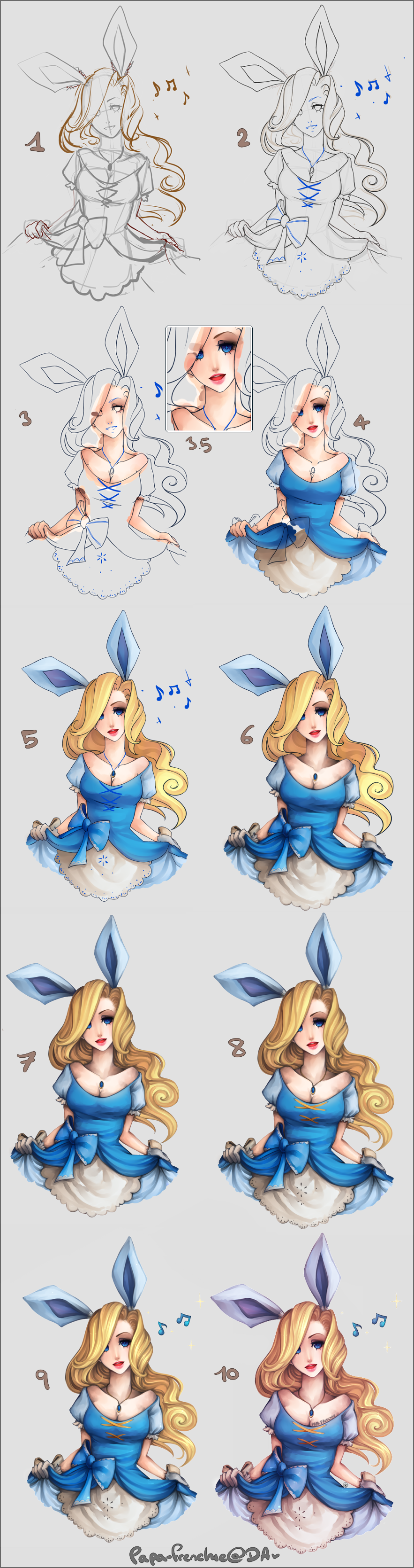
1. Sketching:
Nothing special here! Always start with a basic figure; and I add the character details (clothes, hair, etc) with darker/different colors. I always start with a bg other than white cause I find it quite destablizing when it is pure white ;-;
2. Lineart:
Again, nothing very particular. I don't have a special brush size I use, it all depends on the size of the canvas! I use Sai's pen tool to do this. Several elements of the lineart are in a different color (blue, here). these are actually on another layer, and correspond to details I do not want to have in the lineart, as I will be just using them as guide while painting them directly on/include them in my coloring. Basicly;; this just makes it easier for me to distinguish what is part of which layer.
For the following color steps, my lineart is always on MULTIPLY at around 80% opacity. I tend to recolor it into something other than black (dark brown, dark blue, depends on the colors of the drawing).
3. Coloring: Skin
I consider this whole following coloring process as more of a "base color + shading" thing.
I always start with the lightest tone, and progressively add in darker shades. I use sai's brush tool to blend colors together.
3.5: Coloring: Face
Right after finishing up the skin, I conccentrate on the face; usually in this order: Eyes> nose>lips. As you can see here, I've removed that blue lineart bit cause i've incorporated it into my coloring.
Links to Lips + Eyes progress:
[link] ; [link]
4. Coloring: Clothes
Like with skin, I use the lightest tone first, and add in the shading + blend with the brush tool. It doesn't really matter to me if things might look messy at this point, cause as said earlier, It's more of a "base color + shading" thing. I'll be fixing it later~
I'd also forgotten the gloves so at this point I drew them in ahahahaha ;X
5. Coloring: Hair
Blonde is a color I'm not really good at D; However, it's the same process of going from lightest tone to darkest, with the exception of using the marker tool instead of the brush tool. I think using the markertool makes the strokes... not as blurry? I prefer using that at this point.
I've also colored the ears and gloves and other accesories
6. Paint over: Clothes + Skin
Here's where I fix things up (whether is be messy coloring, or too basic shading).
When done with the basic coloring, I merge with the lineart, and duplicate this single layer. I'll only be working on the top one - the duplicate is incase I mess up or "derive" from the original lines.
I mostly use the brush tool here, with a few exceptions of the water tool. It's simply a process of painting/blending the lineart into the rest of the color, and smoothing the whole general coloring out! Things tend to go slightly greyish (which I hate), but I usually fix that with effects later.
7. Paint over: Hair
The reason I dont put too much detail in the hair when coloring it the first time is that now, at this step, I usually end up doing alot of changes in the flow/lines i've made. I tend to take ages doing this part....
It's also time to blend the hair roots a bit more into the skin.
8. Details
Remember the rest of the blue lineart? Well here's where it completley disappears: I add in all the remaining details from it. Here, that's the pattern in the lace, the dress detail, and the necklace.
9. Shinies
You may have noticed that I never speak of highlighting or anything like that - that's cause I dont ever use a lighter color once i've put that base in. Everything just gets darker. (I should fix that habit of mine though). Here's the only moment I'll be doing anything near adding brighter stuff: Adding tiny little shiny things, cause I like that ;X
I usually overlay white or use luminosity to do this. Most of this is concentrated on the hair, but there are some in other places, although rarer (clothes, eyeshine, necklace, lips...)
10. Effects
I said earlier that My drawings go greyish - so this is what I do instead. EFFECTS. What I do varies from picture to picture, but it involves playing around with layermodes and such~
I think it helps the colors I chose harmonize a bit more ;x
To finish: Sharpen in GIMP, and I add a white outline~
That's it!
| Рубрики: | Tutorials | Уроки/2D - растровая графика Photoshop, Corel Paint Shop Pro, Corel Painter, SAI, GIMP, Tux Paint |
| Комментировать | « Пред. запись — К дневнику — След. запись » | Страницы: [1] [Новые] |


