[�������] 11 ����� ������� � �����, ����� ������������ flexbox |
� ������ ������, ��� � flexbox �������� ����� �������� � ������ ������� ������� ����� �������� ��� float'�� � clearfix'��.
������ ������� � ��������� ��� ������ � ���; ���-�� �������������, ����� � �� �����, ��� ��� ������ ��������. � �������� �����, ������ ������� ������. � ������� ���, ���-�� ������ ���� �� �����. ��� �� ��� ������� ���� ����������?
� ����� ������, ��� ����������, �� ������ ����, � ��� ������� ��� ��������� ����� � CSS. ��� ��� ���������� �� ����, ��� ���� ������� �����, � ����� ������ ���� ����������� � ���� ������� � ��� ����?
��� �� ��� �� ����, � ����� ��� ���� ����� ���� ��� �������� ����������� � ������� flexbox ������� �������. �� ������ ����, ����� ��������� 10 ��������� ����-������, � ����� ����������� �������� � ��������� � ��������� The CSS Flexible Box Layout Module Level 1 Spec
��� ������� �������.
� �����, ��� ����, ��������, �� ������ ��������� � ��������� � ��������� ����� �����, � ������� ������ ������...
� ���� ������� ���� �������� flex: 1, ����� ������� ��������� �������� � ������� ����� ������.
��� ������ flexbox � ����� ������� ����. ������� ���� ����� �������.
�� ��������, �� �����-�� �������, �� �� ������ ������ ������� ������ ��� ���� ����� ������� ������ ������� ������. �����, ������ ��� � �������� ���� �������������, ����������� ��� �����-���� ������ �������, ������� � �� ���� ���������.
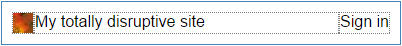
�������� �������! ������ �����, �� ������ ������� �����: ������� ���� ������� ������, ��������� margin-left: auto �� ������ ��������. ����� �� ���� ��� � float: right.
��������, ���� ������� ����� �������� ������������:

��� �� ����� ��������� flex � �����������, ��� �� ����� ��������� space-between � flex-����������, � ������ ��������� margin-left: auto �� ������ ������ (�Sign in�):
.header {
  display: flex;
}
.header .logo {
  /* nothing needed! */
}
.header .sign-in {
  margin-left: auto;
}���� ����� ���������� ��� ��������� �����, �� ���, ��� ����� ��� � ������ ������������ ��� ������ ������� flex-������� � ����� flexbox'�. � ������� ���� ���� ���� �����: "������������ � ���� margin'���".
�, ��� ����� ������� ����� ���������, ��� � ����������� flex-direction: row ����� � ���� ����-�����, �� ��� ��������� ����� � � row-reverse ��� column ��� column-reverse.
��������, �� �������, ��� �������� ��������� ��� flex-�������� ������ flex-���������� ���������, ��� ���� ����� �������� �������. ���������, ���� �� ������� flex-shrink: 1 �� ���������, ��� ��� � ����� ���� �����, ������?
�����, ������.
������, � ���� ���� ����� DOM, ������� ���������� ����� �� ������� � ������ ����� �� ������.
�� ��������� ��� � ������� flexbox � ��� ������.
.book {
  display: flex;
}
.book .description {
  font-size: 30px;
}
.book .buy {
  margin-left: auto;
  width: 80px;
  text-align: center;
  align-self: center;
}(��������� �� ������ ������ �������� ������ � ���� ��� ����� �������� �������� � ��, ������ �����, ������ margin-left: auto)
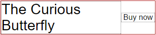
�������� ����� �������� �������, ������� ��� ���������� ������� ������������ ������� ����� � ����� ��������� �� ��������� ������. �� ��������, ����� ���������. �� �������� ����������� ���� ��� � ��������, � ������������, ��� �� �������� ���.
� ����� ��������� ���������� �������. ������ �� �������� ����.
����� ������, ����� � ���� �����������, ������� ����� � ������� ������ � ��������.
��� �������!
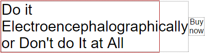
���� ������� ������� ���������� ������ ���������, � �� ��������� ������������ (overflow: hidden), �� ������ ��� ������� ���� ������ ��������. ���� ����������� ��������� � ��� � ��� ������� ������ � ����� ��������.
(����������: � �������, ��� ��� � �������, ���� ������� QA �������, ������� ��������� ���� ���� ������ ����������� �������, ��������� ������. � ���������, ������ ��� �������� �������� ���� ��������� ������������.)
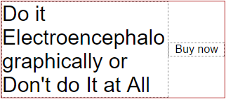
�����������, ����� ��������� ���������� ��-�� ����, ��� min-width �������� �������� ���������� ����������� � auto, ��� � ������ ������ ��������� ������ ����� Electroencephalographically (�����������������������). Flex-�������� ��������� �� ����������� ���� ��� ��� ��� �����.
�������? �������������� ��� ���������� ����������� ������ min-width: auto ��������� min-width: 0, �������� flexbox'�, ��� ���� ������� ����� ���� ���, ��� ���������� ������ ����.
������ �� ���������� ������� ������ �������� ��������� ��. � ��������� ��������� �����. ����� �������, ���� CSS ����� ��������� ���:
.book {
  display: flex;
}
.book .description {
  font-size: 30px;
  min-width: 0;
  word-wrap: break-word;
}
.book .buy {
  margin-left: auto;
  width: 80px;
  text-align: center;
  align-self: center;
}��������� ����� �����:
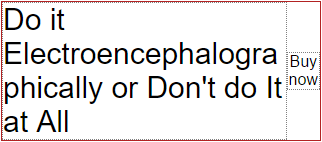
����� ��, min-width: 0 �� �����-�� ��� ��� ������ ���������, ��� ������������ ��������� ����� � ������������.
� ��������� ������, � ������� � ����, ��� ������ �������� ������ �� 80 �������� �� ������, ��� � �������� ���� �� ������.
��� �� �������� ������, �������� flex �������� ������� ������� flex-grow, flex-shrink � flex-basis.
������ ��������, � �������� ����� ���������� �����, �����-�������� ��������� �������� ��� ���� ������, ����� ������� ��������� �������� �������� ���, ��� ���� ���.
��� � �� ���� �� ��� ����, ��� ��, ���, � ����� ������, � ���� ���� �� ���� ����������:
�������, ��� �� ���� �� �� ������������ ��������� � ������ ������ ��� �������������.
������ ��, ������� Flexbox'� (��� �������� ������, ��� ������� flexbox'� ����� ������� ������ � ���� �������� ����� � �������� ������� � ������� �������). ��� ��� ���� ��� �����������? �� ��, ������� Flexbox'� �����, ��� � ���� ��� ��� ���������� ������� � ����������� �������. ������� ��� ���� �� �������� ����� ���������� ��� ����.
������ ������ � ��� �������� initial ��� ��� �������� ����� �� �����. ��� ������� ������ ������������ flex: auto, � flex: none ������������ ������� ������� ����� ������� �� ������� ������.
��� �� ��� ������! (Who woulda thunk it � ���� ����, ����. �����������)
��� ��� ���� �� ���� box-shadow: garish, ��� �� ��������� ��������� 2px 2px 4px hotpink ������ ��� ��������� ��������� ��������� �� ����������.
�������� � ���������� ���������� �������� �������. ����� ������� �� ������ �������� ��������� ������� ��� ������� �������...
� ��� ����� ���� ���� ������ �� ��� flex: none:
.book {
  display: flex;
}
.book .description {
  font-size: 30px;
  min-width: 0;
  word-wrap: break-word;
}
.book .buy {
  margin-left: auto;
  flex: none;
  width: 80px;
  text-align: center;
  align-self: center;
}(��, � ��� �� ������� flex: 0 0 80px; � ���������� ������ CSS. �� ���� ���-�� ��������� � ���, ��� ���� flex: none ������������� ��������� ����. ��� ������ ��� �������� ������ ������� ������� ��� ��� ��� ��������.)
�� ������ ������, � �����, ��� ���� ����� ���� ��� display: inline-flex ��������� ������� �����. � ��, ��� ��� ������� ���������� flex-���������, ������ ��������.
�� �� ���� ������, 28% ����� ��� �� ����� �����, ��� ��� ������ ������, ������ 28%.
�������� ��� ��, ��� � ���� ����������, �� � ������, ��� � �����-�� ������, ����� ������� ������ ���������� ������������, � ��� ����������� vertical-align: middle � ������ �������, ����� ��� �� ���������.
������ � ���� ���������, ����� �� ������������, ��� "������������ ������������ �� ������ �� flex-�������" (��� �� ��� � float, ������).
��� �� ������ ������ ������� ��������, ��� ������ ������-��-�������, ��� ��� ������ ����� ��� ������� � �� ������� ��������.
�������� ������� ��������� �������� ������������� ��������� � padding'�� ��� margin'�� �� flex-���������� � � �������, ������������ flexbox.
�� ���� ������� ��� ����� ������� ������ �� ����, �����-���� ��������������, ������������:
�������: ��� ����������� ������, �� ��� � �������� �������� ������� ��������� ���� (��� ���������� ����� ����������, � ��� ���������� ������ CSSWG)...
���������! ������������� ���������� ������������.
��������, �� ��� ������, ��� margin'� ������ ������������ ������. �� ����� ������ �����, ��� margin'� �� ������������ ������ � ��������� ������ �������.
� ������ �� ��� �����, ��� margin'� �������� flex-��������� ������� �� ������������.
� �� ������, ��� ��� ���� ���� �� �����. �� � ��������, ��� � ���� ����, ����� ����, ��� ����������. ��� � �������� �� �� �������, �� ������� � ����� ������� ��������� ���� � ������������.
������� � ���� ���� ����� ������ �������, ������� ������ ���� ���, � ���� ���� �������� ���?�, � � ���� ��������, � ������������, � �� ��������, ��������. ��, � ���� �� ��� ��������� position ���� � ���� ������ z-index �� flex-��������?�, � ��� � ����� ��� ������, �� ��� flex-���������.
����� ���� ���������� ���������� �������� ����� initial, auto � none, ��� ������ ������� �������, � ������, ����� � ����� flex-basis, �������, ������, � �� ���� ��������� ��� ��������� ��� �����������. ������ �����������, ���� � ���� ���� ����.
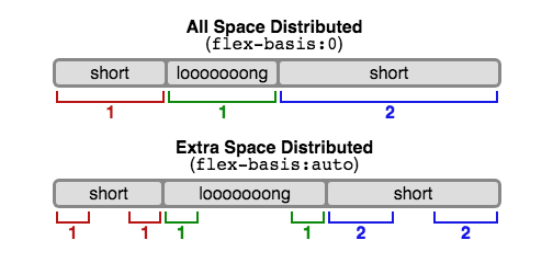
���� � ���� ���� ��� flex-�������� � flex-���������� 3, 3, 4, ����� ��� �������������� ������ 30%, 30% � 40% ���������� ������������, ���������� �� �� �����������, ���� �� flex-basis ����� 0. � ������ ���� �� ����� ����.
��� �� �����, ���� �� ������ ����� flex ��� ���� � ����� �������������, ������������� ������, ��������� flex-basis: auto. � ���� ������ flexbox ������ ���� flex-�������� �� ��������, �� ����� ����� � ������ �������, �������� �������, � �������� ������, ���������� �� ��� ������ ����.
������� �� ��� ������ ��������� �� ������������:
� ������, ��� ��� ��������� �� ������� ���� � ����� �� ����-������ ��� flex, ������� � �����, �� �� �����-�� �������, �� �������� ���� �� ������ ��� �������� � ������������ (schmick pick in the spec)(������� ����� ���� �� �� ����� ��������).
����� � ����� ��������� flex-�������� �� ���������, � ������ ����������� align-items: center. �� ����� ��� � vertical-align, � ���� ���� ����������� ���������� �������� � baseline, ��� ����� ���� ����� ���������� ���� � ����� ��������� ��������� ������ ������, � �� ������ ��������� �� ����.
�������� ��������, align-self: baseline ���� ��������.
������� �� ��� � �� ����� ��������� ��������, � ������� ����������� ��� ������...
������ ����������� � ��� ����������� ������ ����������� �� �������� ���, �������, ���� �� ����� ����������� ������, � ������� ����� ������������ ����������� � ������������ ������� �����-�������, ��������������� ����� ����������� ������, � ����� ������������� ������� � ������� �������� ������������� ��������� �������, ���� ��� ����������.
The content size is the min-content size in the main axis, clamped, if it has an aspect ratio, by any definite min and max cross size properties converted through the aspect ratio, and then further clamped by the max main size property if that is definite.
����� �������� ����� ��� ���������, ������������� � ������������� ��������, �������������� �� ����� ����������� �����, � ��������� ��� ��� �������, ����� ������� ��� ��� ���� �������� ����� ������ ��� � ����� ����.
��� ����� ����� ���� � ��� ���� ������ ������� ���� ��� �����, � ������ ��, ������ ������ � ������� ������, ���������� ���� � �������� ���������� �������, ������� �� ����� ����� ������� � ������� ��������.
���� � �����������, �� ������ ��� ����� � ������, ��� ������ ������ ����� �������� ����� (��� ��������� ������, ���� �� ����� ��� �������� ������).
����� ���������� �� ����, ��� � �����, ����� ������������, ��� ��, ��������� �������� ���� ��� ���������, �������� �� ��������� ����-������ ������� � ��������, � �� ��, ��������� ������������ ������� �������� flexbox. �����������, ��� ����� � ��� �� ������ ������� ����� � ��� �� �� ���� � ���.
� ������������� ���� ��������, ��� �����, ����������� ���� �� ������, ��� ���������. � �������� �� ������� ����, �������� ���� margin'�, flex-�������� � ������� ������ auto ��� none, � ����� ����������� ������ � ���� ���, ��� ��� ���� �����.
� ����� �������� � ����� ���� ������, ���� ��� � ����� ��� ������� �������.
��� � �����, ��� �������� �� ��, ��� ������������ � ������� � ������������ � ������������� ��� �������� ��� � � �����, ��� �� �������� ����� ������������� ���� � ��������. � ��� ���� �������� ����� ������� �������� ���-������������ ����� ����������.
������ ��� ������� ������, ������ ��� � ��������� ���� ��� ��� ������� �������, ��� ��� ���� �� ����� ��������� ���� �� �������.
������, ���� ���������, ��� ���� ���� � ��������� ��� ��������� CSS ������������.
P.S. � ������ ���������� ��������� ��������� ������ ���� flexbox ����� �� ���������:
github.com/philipwalton/flexbugs
�� �����������: ��� ��� ������ ���� �������� ���������� ����������, ���� ���� ���������/�����������/������� �� �������� �������� ��� �� �����������, ������ � ������������.
������������ ���� �����: hackernoon.com/11-things-i-learned-reading-the-flexbox-spec-5f0c799c776b
| �������������� | « ����. ������ — � �������� — ����. ������ » | ��������: [1] [�����] |


