Karl Dubost: Figuring out viewport differences in between Gecko, Blink and WebKit |
We had a couple of Web Compatibility issues on the rendering of some sites related to the viewport information. Here after is a preliminary test for trying to figure out what are the sources of variability.
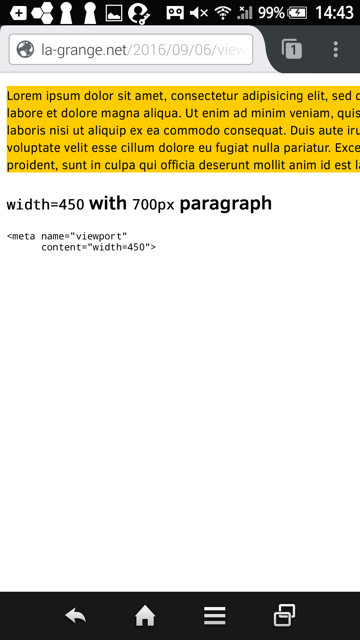
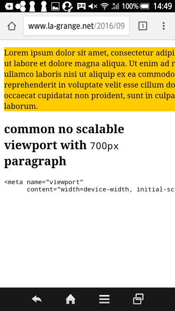
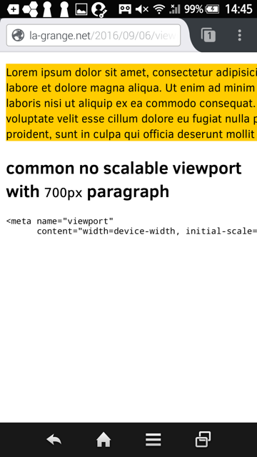
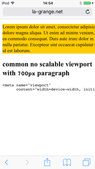
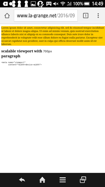
The major visible difference is only for the last case where Firefox and Chrome do something different.
initial-scale=0I haven't tested all combinations yet. Just a couple to have an idea. This is preliminary work to figure out the Web Compatibility space.
Maybe I can adjust tests in the future.
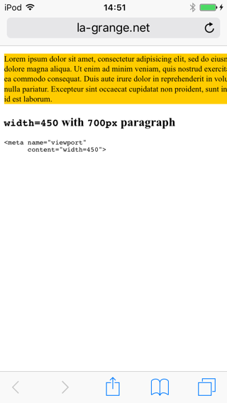
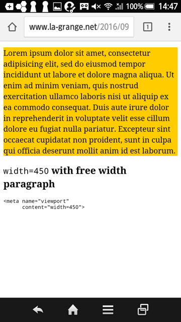
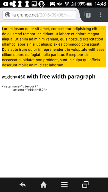
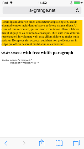
case A and case F below seems to highlight differences in between Gecko and Blink. Chrome seems to apply different logic for resizing the content.
Using this page instrospection tool
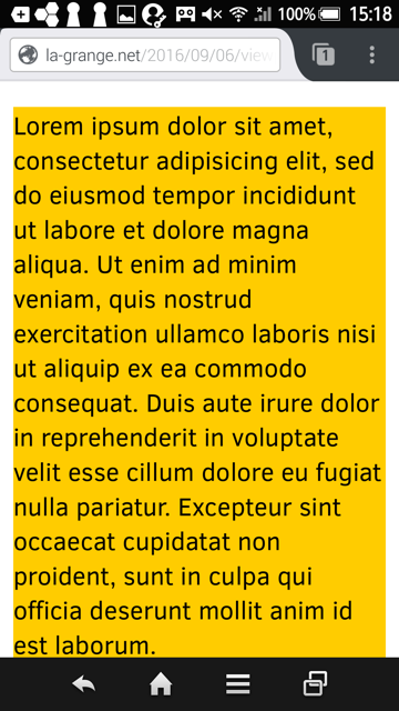
window.innerWidth = 320
window.outerWidth = 0
window.screen.width = 320
document.documentElement.clientWidth = 320
window.devicePixelRatio = 2
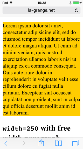
window.innerWidth = 360
window.outerWidth = 360
window.screen.width = 360
document.documentElement.clientWidth = 360
window.devicePixelRatio = 3
window.innerWidth = 360
window.outerWidth = 360
window.screen.width = 360
document.documentElement.clientWidth = 360
window.devicePixelRatio = 3
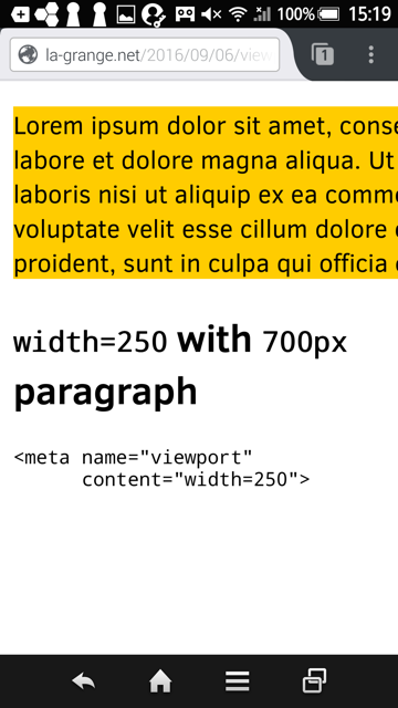
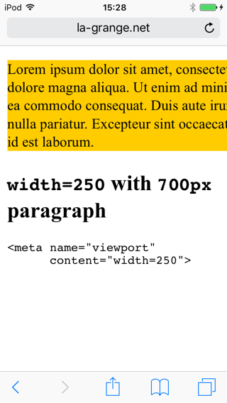
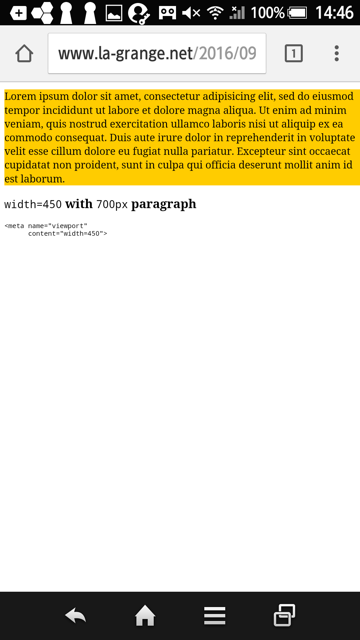
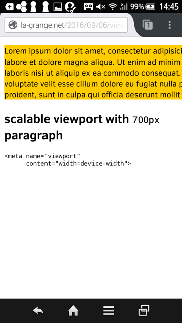
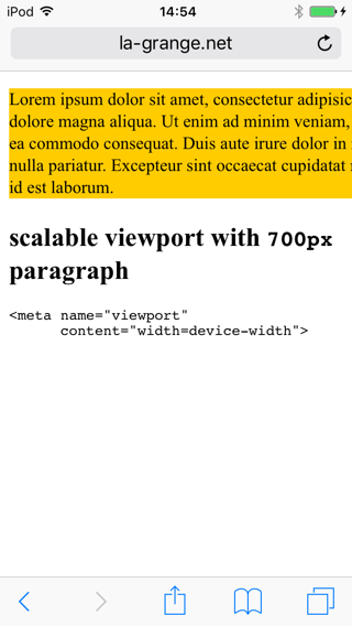
width=250 with 700px paragraphwidth=250 with free width paragraphwidth=450 with 700px paragraphwidth=450 with free width paragraph700px paragraph700px paragraph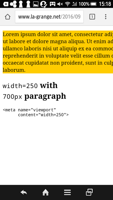
Otsukare!
http://www.otsukare.info/2016/09/06/viewport-differences-mobile
| Комментировать | « Пред. запись — К дневнику — След. запись » | Страницы: [1] [Новые] |


