Andrew Sutherland: Web Worker-assisted Email Visualizations using Vega |

tl;dr: glodastrophe, the experimental entirely-client-side JS desktop-ish email app now supports Vega-based visualizations in addition to new support infrastructure for extension-y things and creating derived views based on the search/filter infrastructure.
Two of the dreams of Mozilla Messaging were:

At the time, the protovis JS visualization library was the state of the art. Its successor the amazing, continually evolving d3 has eclipsed it. d3, being a JS library, requires someone to write JS code. A visualization written directly in JS runs into the whole code review issue. What would be ideal is a means of specifying visualizations that is substantially more inert and easy to sandbox.
Enter, Vega, a visualization grammar that can be expressed in JSON that can not only define “simple” static visualizations, but also mind-blowing gapminder-style interactive visualizations. Also, it has some very clever dataflow stuff under the hood and builds on d3 and its well-proven magic. I performed a fairly extensive survey of the current visualization, faceting, and data processing options to help bring visualizations and faceted filtered search to glodastrophe and other potential gaia mail consumers like the Firefox OS Gaia Mail App.
Digression: Two relevant significant changes in how the gaia mail backend was designed compared to its predecessor Thunderbird (and its global database) are:
In terms of visualizations, what this means is that we pre-chew as much of the data in the worker as we can, drastically reducing both the amount of computation that needs to happen on the main (page) thread and the amount of data we have to send to it. It also means that we could potentially farm all of this out to the server if its search capabilities are sufficiently advanced. And/or the backend could cache previous results.
For example, in the faceted visualizations on the sidebar (placed side-by-side here):
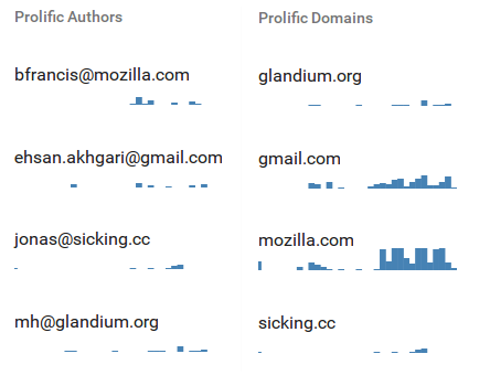
In the “Prolific Authors” visualization definition, the backend in the worker constructs a Vega dataflow (only!). The search/filter mechanism is spun up and the visualization’s data gathering needs specify that we will load the messages that belong to each conversation in consideration. Then for each message we extract the author and age of the message and feed that to the dataflow graph. The data transforms bin the messages by date, facet the messages by author, and aggregate the message bins within each author. We then sort the authors by the number of messages they authored, and limit it to the top 5 authors which we then alphabetically sort. If we were doing this on the front-end, we’d have to send all N messages from the back-end. Instead, we send over just 5 histograms with a maximum of 60 data-points in each histogram, one per bin.
Same deal with “Prolific domains”, but we extract the author’s mail domain and aggregate based on that.

Similarly, the overview Authored content size over time heatmap visualization sends only the aggregated heatmap bins over the wire, not all the messages. Elaborating, for each message body part, we (now) compute an estimate of the number of actual “fresh” content bytes in the message. Anything we can detect as a quote or a mailing list footer or multiple paragraphs of legal disclaimers doesn’t count. The x-axis bins by time; now is on the right, the oldest considered message is on the left. The y-axis bins by the log of the authored content size. Messages with zero new bytes are at the bottom, massive essays are at the top. The current visualization is useless, but I think the ingredients can and will be used to create something more informative.
Other notable glodastrophe changes since the last blog post:
More to come!
https://www.visophyte.org/blog/2016/03/21/web-worker-assisted-email-visualizations-using-vega/
| Комментировать | « Пред. запись — К дневнику — След. запись » | Страницы: [1] [Новые] |


