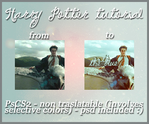
Без заголовка |

|
Метки: ps |
Без заголовка |
|
Метки: ps |
Без заголовка |
 to
to 
 evita_icons for many more tutorials and icons
|
|
Без заголовка |
to |
|
Dramione Icon |
|
|
Dramione Icon |
 >>
>> 
|
|
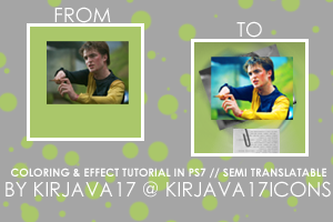
Cedric Diggory coloring & effect tutorial |
|
|
Cedric Diggory coloring & effect tutorial |
|
|
Emma Watson Tutorial |
|
|
Без заголовка |
|
|
Tutorial #3: Harry coloring tutorial |
Okay so here is my third icon tutorial that I promised a couple of weeks ago!
- Its made in Photoshop Elements 5.0
- Really easy to do
- Can be made in almost any graphic progam
Rules
- You can copy my original icon, just credit me (I would prefer you to make it your own though!)
- Don't follow steps exactly, make it how you like it
- And COMMENT!!!
Original Picture: to
or or
or
or
And thats all I have for you all today!
I will be posting some new manips, icons, and wallpapers soon! So keep an eye out!
|
|
Tutorial #2: Emma Icons |
Here is my second tutorial except this one is actually an icon tutorial!
- Its made in Photoshop Elements 7.0
- Really easy to do
- Can be made in almost any graphic progam
Rules
- You can copy my original icon, just credit me (I would prefer you to make it your own though!)
- Don't follow steps exactly, make it how you like it
- And COMMENT!!!
First icon: to
Step 1:
I took this
that I found from Emma Watson's website then cropped it to how I liked it.
Step 2:
In this icon I wanted to make Emma's eyes and lips stand out so I used the sharpen tool over her eyes and lips.
Step 3:
Duplicate that layer and set it to Screen. Then duplicate that layer and set it to Hard Light. then
Step 4:
Make a new layer and fill it with #c75ee9 at Saturation.
Step 5:
Make another new layer and fill it with #090295 at Soft Light.
Step 6:
Duplicate your base picture, drag it to the top, and set it to Luminosity at 50%.
Step 7:
Duplicate your base picture again and put it to the top. Put the blending mode to Hue at 50%. Then erase the eye out of all of the layers except for the first two layers. (steps 1 & 2)
And here is what it looks like . . .
Now you can add text, textures, or whatever you want too!
Second Icon: to
Step 1:
I got this
from Emma Watson's website and cropped it to how I liked.
Step 2:
Duplicate that layer and set it to Screen.
Step 3:
Next make three new layers. Fill the first one with #0c188b and set it at Difference. Fill the next one with #e94ee7 at Saturation. Fill the last one with #e3b46b at Hue 75%. to
to
Step 4:
Lastly, duplicate the base picture, drag it to the top, and set it to Hue at 100%.
And here is the final piece . . .
And finish it off however you like!
|
Метки: tutorial |
Requested Coloring Tutorial |
|
|
Emma Icon Tutorial |
 mata090680, I don't claim credit for it.The tutorial is for the first icon up there, but there is a vague summary at the end for other icons.tralala_icons
|
|
Tutorial: Dumbledore |
|
|
Tutorial #1: Gryffindor Trio Screencap |
Tutorial #1: Gryffindor Trio Screencap
9 steps, good for beginners, pretty cool!
From this:
To this:
Or this:
It doesn't look all that good, but I used a bunch of different techniques!
Step 1: Open a screencap or picture of the trio or whatever you like. Change the lighting, color, sharpen & blur, etc. Change whatever you want to make it look better!
Here is the screencap I will be using. (Thanks so much to
homeofthenuttyfor all the great screencaps.)
Step 3: I really want to make the Gryffindor colors stand out so I increased the saturation (my setting was +45). Do it only on the copied ties and stripes!
You should have something like this.
Step 4: Now, to make it even more interesting, I desaturated the base picture. But I didn’t like the complete black & white, so I undid the desaturation part and instead only desaturated it a little bit (mine was -65).
OPTIONAL: I went back to the copied ties and stripes then duplicated that layer. I set it to hard light at 50%. It gives it more solid, darker color. So it looks like this.
Step 5: Finally, merge all the layers together.
Step 6: Now, go to Filter - Distort - Diffuse Glow. I set the Graininess to 0, the Clear Amount to 15, and the Glow Amount to 10. Make sure your background color is set to white! I didn’t like how Harry and Hermione’s faces were glowing and Ron’s wasn’t, so I used the Burn Tool over Harry and Hermione’s faces. Try to match it best with how Ron’s face looks!
This is how it should look.
Step 7: I still didn’t like how it looked so I duplicated the base picture and set it to multiply at 50%. And then I desaturated it completely and also increased the lightness to 30. But Harry and Hermione’s eyes were darker than I wanted so I used the Dodge Tool on just their eyes. Merge those 2 base pictures together.
This is where you could stop.
OPTIONAL: I also added a motioned blurred background. First, you duplicate the base picture twice. Then, go to Filter - Blur - Motion Blur and set the distance to 35 and leave the angle at 0. Then with the second duplicate picture you take the Background Eraser Tool and erase the background that you want zoomed. Then merge the layers and you should have something that looks like this!
Step 8: To add a little something more to this picture, I took this texture
and put it to color dodge. Then I erased whatever was covering their faces.
Now you have this!
Step 9: The last thing I did was add this texture
by
dearestand put the blending mode to multiply!
|
|
Emma Watson Tutorial |
magicaltrio|
|
Rita Icon Tutorial |
colorfilter and paste it over your image|
|
Requested coloring tutorial |
jennijube.|
|
| Страницы: [1] Календарь |