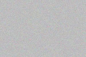
1. First make a new layer. Fill it with #BDBDBD or whichever color you wanna use.
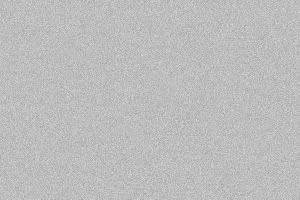
2. Go to (Filters > Noise > Add Noise...) The settings I use:
A
mount: 10.23%
Distribution:
Uniform
Don't check Monochromatic
You should now have this:
3. Next you can either Desaturate the layer (Image > Adjust > Desaturate) or you can add a Gradient Map (Image > Adjust > Gradient Map)
Forground: #000000 (black) l Background: #FFFFFF (white).
I personally prefure to use a
Gradient Map cause it adds alot more contrast and makes everything stand out alot more (eg:
Desaturated![]() /i.ixnp.com/images/v3.11/theme/silver/palette.gif" target="_blank">http://i.ixnp.com/images/v3.11/theme/silver/palette.gif
/i.ixnp.com/images/v3.11/theme/silver/palette.gif" target="_blank">http://i.ixnp.com/images/v3.11/theme/silver/palette.gif); VISIBILITY: visible; PADDING-BOTTOM: 0pt; MARGIN: 0pt; VERTICAL-ALIGN: top; BORDER-LEFT: 0pt; WIDTH: 14px; LINE-HEIGHT: normal; PADDING-TOP: 1px; BORDER-BOTTOM: 0pt; BACKGROUND-REPEAT: no-repeat; FONT-STYLE: normal; FONT-FAMILY: "trebuchet ms",arial,helvetica,sans-serif; POSITION: static; TOP: auto; HEIGHT: 12px; BACKGROUND-COLOR: transparent; TEXT-DECORATION: none" src="http://i.ixnp.com/images/v3.11/t.gif" alt="" /> l
Gradient Map![]() /i.ixnp.com/images/v3.11/theme/silver/palette.gif" target="_blank">http://i.ixnp.com/images/v3.11/theme/silver/palette.gif
/i.ixnp.com/images/v3.11/theme/silver/palette.gif" target="_blank">http://i.ixnp.com/images/v3.11/theme/silver/palette.gif); VISIBILITY: visible; PADDING-BOTTOM: 0pt; MARGIN: 0pt; VERTICAL-ALIGN: top; BORDER-LEFT: 0pt; WIDTH: 14px; LINE-HEIGHT: normal; PADDING-TOP: 1px; BORDER-BOTTOM: 0pt; BACKGROUND-REPEAT: no-repeat; FONT-STYLE: normal; FONT-FAMILY: "trebuchet ms",arial,helvetica,sans-serif; POSITION: static; TOP: auto; HEIGHT: 12px; BACKGROUND-COLOR: transparent; TEXT-DECORATION: none" src="http://i.ixnp.com/images/v3.11/t.gif" alt="" />) which is how I like it but that is totally up to you. With a texture like this, the difference isn't a huge one but it still does make somewhat of a difference.
So either way, you should now have something like this:
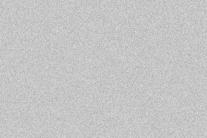
(a gradient map was used on this one)
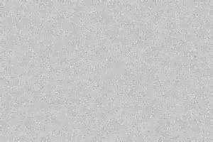
Ok so we are almost there!
4. Now you need to go to (Filters > Blur > Smart blur...) and put in these settings:
Radius: 13.6
Threshold: 22.8
Quality: Low
Mode: Normal
You should now have this:
Looking pretty good. You could leave it here if you want but for me, it was a bit too dotty which brings us to step 5.
5. Go to (Filters > Distort > Ripple...) and put in these settings:
Amount: 688
Size: Medium
And you are done!
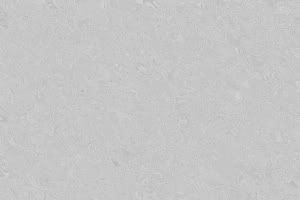
You can now do whatever you want with it. Add brushes, colors, more gundge, anything! Go crazy with it!
Oh and because this was just so easy, no need to credit, it's appreciated but you don't have to. :)
 /i.ixnp.com/images/v3.11/theme/silver/palette.gif" target="_blank">http://i.ixnp.com/images/v3.11/theme/silver/palette.gif


