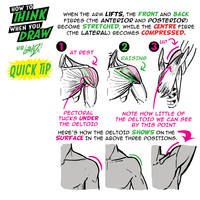
How to THINK when you draw SHOULDERS QUICK TIP! |
SHOULDERS for #howtothinkwhenyoudraw! Tutorials BOOKS (inc. a special 3-BOOK "STARTER SET" for new collectors) available ONLY ONCE THIS YEAR on a SECRET DATE in MAY - the ONLY WAY to get the books is to send "Add me, Lorenzo! to KickstarterBooks@yahoo.com -if you've joined any of our mailing lists before, you're already on it! MAILING LIST CLOSES SOON!
Lorenzo!
|
|
Mega encounters |
Oh look, Newtwo had her own legendary encounters before she met up with the family
perhaps I'll delve more into this later :>

https://www.deviantart.com/tc-96/art/Mega-encounters-905832403
|
|
3163. Bananasaurus Poses |

https://www.deviantart.com/cryptid-creations/art/3163-Bananasaurus-Poses-905799902
|
|
Sol The Wolf Huntress - Full Character Design |

https://www.deviantart.com/jesonite/art/Sol-The-Wolf-Huntress-Full-Character-Design-905665236
|
|
Magic game |
Copyright © by Gene R. von Edler aka Ellysiumn. All rights reserved.
My artwork may not be reproduced, copied, edited, published or uploaded in any
way without my written permission.
My art can NOT be used to create a NFT. Only I have the authority, as a creator, to create an NFT of my art.
If I find out, I'll go straight to the laws.
https://www.deviantart.com/ellysiumn/art/Magic-game-905663926
|
|
When you're a gentle giant and good with kids :) |
More Nintendo Stuff:


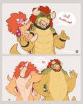

https://www.deviantart.com/earthsong9405/art/When-you-re-a-gentle-giant-and-good-with-kids-904357471
|
|
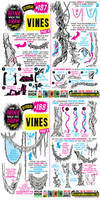
How to THINK when you draw VINES TUTORIAL! |
VINES for #howtothinkwhenyoudraw! Tutorials BOOKS (inc. a special 3-BOOK "STARTER SET" for new collectors) available ONLY ONCE THIS YEAR on a SECRET DATE in MAY - the ONLY WAY to get the books is to send "Add me, Lorenzo! to KickstarterBooks@yahoo.com -if you've joined any of our mailing lists before, you're already on it! MAILING LIST CLOSES SOON!
Lorenzo!
|
|
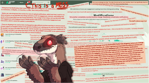
#Deviantart Listen To Your Users Challenge |
The new notification center is perhaps the least intuitive, most user-unfriendly update I believe we've seen thus far. This is my feedback/suggestions:
Split notifications into clearly divided categories (comments/replies/favorites/mentions). The new notification center sorely needs to have an option to sort comments from favorites. As is, it's pretty annoying trying to comb through hundreds of favorites notifications to find and reply to the (much rarer, in comparison) comments. There also needs to be a way to sort comments from replies. Mentions also need to be their own separate, easy-to-access category.
The scroll bar needs to be wider. It's a thin little sliver. It's already terrible trying to wade through a mess of notifications, and this is made even worse when your cursor misses the tiny scroll bar and accidentally closes out the notification sidebar, forcing you to start reading again from the top. It's a pain to use. Also, just a personal thing, but I'm not a fan of the choice to leave 7/8ths of the notifications page blank and give us a teeny drop-down panel on the left-hand side to actually scroll through notifications. This is not a good use of space, an art website should know better.
Provide an option to mass-remove notifications. This one is fairly obvious. The only current options are to manually delete each notification one by one (a laggy, awful experience), or mark them all as read, which still doesn't remove them.
Please, pair notifications with the watch feed. The same way things used to be, before Eclipse was launched. Separating notifications from watch (and making the watch feed a cluttered mess to sort through) has drastically reduced user engagement with art. I know from my own experiences that my audience engagement (comments, favs, etc) was reduced by 48% effectively overnight, and has not recovered since the launch of Eclipse.
Provide a way to opt-out of the update. Users should not be essentially forced to beta-test, especially not if staff are then going to ignore user feedback. Right now, it very much feels like staff doesn't give a damn about building a functional art website.
With this latest update, I honestly feel there is little reason to continue using deviantart. I will try to stay here for as long as I can....but I am not going to waste my time trying to navigate the worst, least intuitive update this site has ever rolled out. I will leave, if it comes to that. I can see other artists branching out to other sites, and I plan on doing the same. I'm currently dipping my feet in the water over at Buzzly, here's my account: buzzly.art/~Lopoddity.
As always, I post art much more frequently on my patreon (there's a ton of content there that hasn't made it's way here yet): www.patreon.com/lopoddity
Complaint over. Thank you for reading, and thank you all for the support over the years. <3 You all are the reason I've stayed here as long as I have, and the reason I'll try (emphasis on try) to stay longer.
https://www.deviantart.com/lopoddity/art/Deviantart-Listen-To-Your-Users-Challenge-905597969
|
|
Usagi's room |

https://www.deviantart.com/dav-19/art/Usagi-s-room-905574887
|
|
Spring Keeper |

https://www.deviantart.com/yuumei/art/Spring-Keeper-905568761
|
|
Wott's Up |

https://www.deviantart.com/introvertnacho/art/Wott-s-Up-905510189
|
|
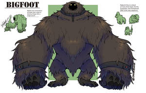
Bigfoot |
A brutish and powerful bioweapon created from experimenting on apes, Bigfoot is strong enough to obliterate most things around him with ease. His skin is quite tough, able to resist most firearms and his fur allows him to camouflage in with some of the surrounding areas.
The name for Bigfoot was agreed upon from a joking remark amongst the other scientists as Bigfoot is a giant ape.
*Pantheon categorizes their experiments on a danger scale from 1-10, 1 the least dangerous to 10 the most dangerous.
https://www.deviantart.com/bangboodoragon/art/Bigfoot-905502101
|
|
party possum |

https://www.deviantart.com/supichu/art/party-possum-905445018
|
|
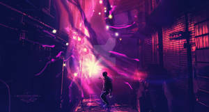
Deadly contrast ( speedpaint 1h ) |

https://www.deviantart.com/anatofinnstark/art/Deadly-contrast-speedpaint-1h-905448338
|
|
Smothered by the all consuming clouds. |

https://www.deviantart.com/lawrencecornellphoto/art/Smothered-by-the-all-consuming-clouds-905441432
|
|
Emma Frost |

 Facebook
  Twitter Tumblr Youtube Instagram Twitch
https://www.deviantart.com/dandonfuga/art/Emma-Frost-905370715
|
|